pacman::p_load(knitr, spdep, tmap, sf,
ggpubr, GGally, cluster, funModeling,
factoextra, NbClust, ClustGeo,
heatmaply, corrplot, tidyverse)Take Home Exercise 2 - Regionalization of Nigeria with Water points
Overview
Water is a crucial resource for humanity. People must have access to clean water in order to be healthy. It promotes a healthy environment, peace and security, and a sustainable economy. However, more than 40% of the world’s population lacks access to enough clean water. According to UN-Water, 1.8 billion people would live in places with a complete water shortage by 2025. One of the many areas that the water problem gravely threatens is food security. Agriculture uses over 70% of the freshwater that is present on Earth.
The severe water shortages and water quality issues are seen in underdeveloped countries. Up to 80% of infections in developing nations are attributed to inadequate water and sanitation infrastructure.
Despite technological advancement, providing rural people with clean water continues to be a key development concern in many countries around the world, especially in those on the continent of Africa.
We will attempt to regionalize Nigeria with the water points attributes in this exercise.
Data points of interest
In this assignment, we will attempt to regionalize Nigeria based on the following variables:
Total number of functional water points
Total number of nonfunctional water points
Percentage of functional water points
Percentage of non-functional water points
Percentage of main water point technology (i.e. Hand Pump)
Percentage of usage capacity (i.e. < 1000, >=1000)
Percentage of rural water points
Percentage of potable vs non potable water points
Percentage of water points accessible within median of primary road network
Percentage of water points accessible within median of secondary road network
Percentage of water points accessible within median of tertiary road network
Percentage of water points that are managed
Getting Started
First, we load the required packages in R
Spatial data handling & Clustering
- sf, spdep
Choropleth mapping
- tmap
Attribute data handling
- tidyverse especially readr, ggplot2 and dplyr and funModeling
Data visualization and analysis
- corrplot, ggpubr, GGally, knitr and heatmaply
Cluster analysis
- cluster, NbClust, factoextra, and ClustGeo
Spatial Data
The spatial dataset used in this assignment is the Nigeria Level-2 Administrative Boundary spatial dataset downloaded from Geoboundaries
We will load the spatial features by using st_read() from the sf package
As the data we want is in WSG-84 format, we set crs to 4326.
We won’t utilize st_transform() at this time because it can result in outputs with missing points after transformation, which would skew our study.
nga = st_read(dsn = "data/geospatial",
layer = "geoBoundaries-NGA-ADM2",
crs = 4326)Updating Spatial features that have identical name but are in different states
The following code determines whether any LGA names have been repeated. If the shapeName is not distinct for rows, duplicated() returns True. Only rows that satisfy the duplicated rows = True criterion are returned by subset() (Ong, 2022).
duplicate = nga$shapeName[nga$shapeName %in% nga$shapeName[duplicated(nga$shapeName)]]
duplicateFrom the result, there are 12 LGAs that have the same names, even though they are from different states. We will want to rename them or it would be confusing when we conduct further analysis.
Firstly, we create a data frame with the duplicate
nga_dupes = nga %>%
filter(shapeName %in% duplicate)Calling ttm() in the tmap package will switch the tmap’s viewing mode to interactive viewing, which will help us find the states of the respective duplicates in the map. We then plot the map with tmap functions
ttm()
tm_shape(nga_dupes) +
tm_polygons("shapeName") +
tm_view(set.zoom.limits = c(5,10)) +
tm_borders(alpha=0.5) From the result, we can observe the following:
| shapeID | shapeName |
|---|---|
| NGA-ADM2-72505758B95534398 | Bassa (Kogi) |
| NGA-ADM2-72505758B52690633 | Bassa (Plateau) |
| NGA-ADM2-72505758B26581542 | Ifelodun (Kwara) |
| NGA-ADM2-72505758B18326272 | Ifelodun (Osun) |
| NGA-ADM2-72505758B75034141 | Irepodun (Kwara) |
| NGA-ADM2-72505758B79178637 | Irepodun (Osun) |
| NGA-ADM2-72505758B6786568 | Nasarawa (Kano) |
| NGA-ADM2-72505758B67188591 | Nasarawa (Nasarawa) |
| NGA-ADM2-72505758B7318634 | Obi (Benue) |
| NGA-ADM2-72505758B3073896 | Obi (Nasarawa) |
| NGA-ADM2-72505758B6675111 | Surulere (lagos) |
| NGA-ADM2-72505758B31597260 | Surulere (Oyo) |
Based on the results above, we replace the shapeNames with shapeID as the identifier and run the duplicate check again to verify that it is now empty
nga$shapeName[nga$shapeID=='NGA-ADM2-72505758B95534398'] = 'Bassa (Kogi)'
nga$shapeName[nga$shapeID=='NGA-ADM2-72505758B52690633'] = 'Bassa (Plateau)'
nga$shapeName[nga$shapeID=='NGA-ADM2-72505758B26581542'] = 'Ifelodun (Kwara)'
nga$shapeName[nga$shapeID=='NGA-ADM2-72505758B18326272'] = 'Ifelodun (Osun)'
nga$shapeName[nga$shapeID=='NGA-ADM2-72505758B75034141'] = 'Irepodun (Kwara)'
nga$shapeName[nga$shapeID=='NGA-ADM2-72505758B79178637'] = 'Irepodun (Osun)'
nga$shapeName[nga$shapeID=='NGA-ADM2-72505758B6786568'] = 'Nasarawa (Kano)'
nga$shapeName[nga$shapeID=='NGA-ADM2-72505758B67188591'] = 'Nasarawa (Nasarawa)'
nga$shapeName[nga$shapeID=='NGA-ADM2-72505758B7318634'] = 'Obi (Benue)'
nga$shapeName[nga$shapeID=='NGA-ADM2-72505758B3073896'] = 'Obi (Nasarawa)'
nga$shapeName[nga$shapeID=='NGA-ADM2-72505758B6675111'] = 'Surulere (lagos)'
nga$shapeName[nga$shapeID=='NGA-ADM2-72505758B31597260'] = 'Surulere (Oyo)'
duplicate = nga$shapeName[nga$shapeName %in% nga$shapeName[duplicated(nga$shapeName)]]
duplicateOnce we are done, we simply remove the unnecessary columns and keep only shapeName and save the data frame with saveRDS()
nga = nga %>%
select(shapeName)
saveRDS(nga, "data/geospatial/nga_ex2.rds")We can then retrieve the cleaned RDS file using readRDS(), and set the tmap mode to interactive viewing
nga = readRDS("data/geospatial/nga_ex2.rds")
ttm()Aspatial Data
Cleaning the Data
The aspatial dataset used in this assignment is the water point data exchange dataset found in WPdx Global Data Repositories. Data is filtered on the web portal to only keep Nigeria and the file is saved as NigeriaWaterPoints_Raw.csv
As we are only interested in the functionality of the water point, it is important to capture fields that may may aid us in our analysis (Definition are found here: Source)
#clean_adm2 - LGA: The area we are interested in
#clean_adm1 - State: The state of the LGA of Nigeria
#status_clean - Functional: Whether it is functional or not
#management_clean - Management: who manages it?
#subjective_quality - Quality: what is the quality?
#water_source_category - Water Source Category: where the water came from?
#water_tech_category - Water Tech Category: What technology is used?
New Georeferenced Column - WKT: Well Known Text (wkt) representing spatial data in a textual format
is_urban - Is_Urban_Area: Is it in an urban area?
#distance_to_primary_road - dist_to_primary_road: Based on calculations with data from OpenStreetMap, the distance in km to the nearest road.
#distance_to_secondary_road - dist_to_secondary_road: Based on calculations using OpenStreetMap data, the distance in km to the second-closest road.
#distance_to_tertiary_road - dist_to_tertiary_road: Using calculations with data from OpenStreetMap, the distance to the third-closest road is given in km.
usage_capacity: Maximum recommended number of users per water point
To load the raw data file, we use the read_csv function
wpdx_raw = read_csv("data/aspatial/NigeriaWaterPoints_Raw.csv") Most of the columns are irrelevant, so we will perform the following:
keep the columns we want to clean it up by specifying the columns with one to retain with
subsetrenaming the columns using
rename_withReplace all the NA with unknown for columns with NA value present
retain_cols = c('#clean_adm2', '#clean_adm1', '#status_clean', '#management_clean'
, '#subjective_quality', '#water_source_category',
'#water_tech_category',
'New Georeferenced Column', 'is_urban','#distance_to_primary_road',
'#distance_to_secondary_road', '#distance_to_tertiary_road'
,'usage_capacity')
new_col_names = c('LGA', 'State', 'Functional', 'Management',
'Quality', 'Water_Source_Category', 'Water_Tech_Category',
'WKT', 'Is_Urban_Area', 'dist_to_primary_road'
,'dist_to_secondary_road', 'dist_to_tertiary_road'
,'usage_capacity')
wpdx_clean = subset(wpdx_raw, select = (names(wpdx_raw) %in% retain_cols)) %>% rename_with(~ new_col_names, all_of(retain_cols)) %>%
replace_na(list(Functional = "Unknown", Management = "Unknown", Quality = "Unknown", Water_Source_Category = "Unknown", Water_Tech_Category = "Unknown"))We save the processed data frame wpdx_clean into a file, the file will be reduced to 3.4 MB from the 144 MB raw file that we downloaded.
saveRDS(wpdx_clean, "data/aspatial/wpdx_clean_ex2.rds")We can then delete the raw file from the project and retrieve the saved RDS file using readRDS()
wpdx_clean = readRDS("data/aspatial/wpdx_clean_ex2.rds")Converting csv data into spatial features
We can use st_as_sfc() to come up with the new field Geometry by using the WKT field
wpdx_clean$Geometry = st_as_sfc(wpdx_clean$`WKT`)We will then use st_sf() to convert the tibble data frame into sf data frame. The EPSG 4326 code is used as the dataset is referencing WGS84 geographic coordinate system.
We could use st_crs()to verify the coordinate system from the object.
wpdx_clean_sf = st_sf(wpdx_clean, crs=4326)
st_crs(wpdx_clean_sf)Coordinate Reference System:
User input: EPSG:4326
wkt:
GEOGCRS["WGS 84",
ENSEMBLE["World Geodetic System 1984 ensemble",
MEMBER["World Geodetic System 1984 (Transit)"],
MEMBER["World Geodetic System 1984 (G730)"],
MEMBER["World Geodetic System 1984 (G873)"],
MEMBER["World Geodetic System 1984 (G1150)"],
MEMBER["World Geodetic System 1984 (G1674)"],
MEMBER["World Geodetic System 1984 (G1762)"],
MEMBER["World Geodetic System 1984 (G2139)"],
ELLIPSOID["WGS 84",6378137,298.257223563,
LENGTHUNIT["metre",1]],
ENSEMBLEACCURACY[2.0]],
PRIMEM["Greenwich",0,
ANGLEUNIT["degree",0.0174532925199433]],
CS[ellipsoidal,2],
AXIS["geodetic latitude (Lat)",north,
ORDER[1],
ANGLEUNIT["degree",0.0174532925199433]],
AXIS["geodetic longitude (Lon)",east,
ORDER[2],
ANGLEUNIT["degree",0.0174532925199433]],
USAGE[
SCOPE["Horizontal component of 3D system."],
AREA["World."],
BBOX[-90,-180,90,180]],
ID["EPSG",4326]]Lastly, the attribute data from the nga sf data frame will be transferred into the wpdx_clean_sf data frame using a geoprocessing function known as point-in-polygon overlay. st_join() from the sf package can help us with that
nga_wp = st_join(wpdx_clean_sf, nga)Exploratory Data Analysis (EDA)
We can use freq() of the funModeling package to display the distribution of our data points of interest using wpdx_clean_sf. This is to help us aggregate the data as the dataset provide breakdowns of their respective categories.
Categorical Variables
freq(data=nga_wp, input = 'Functional')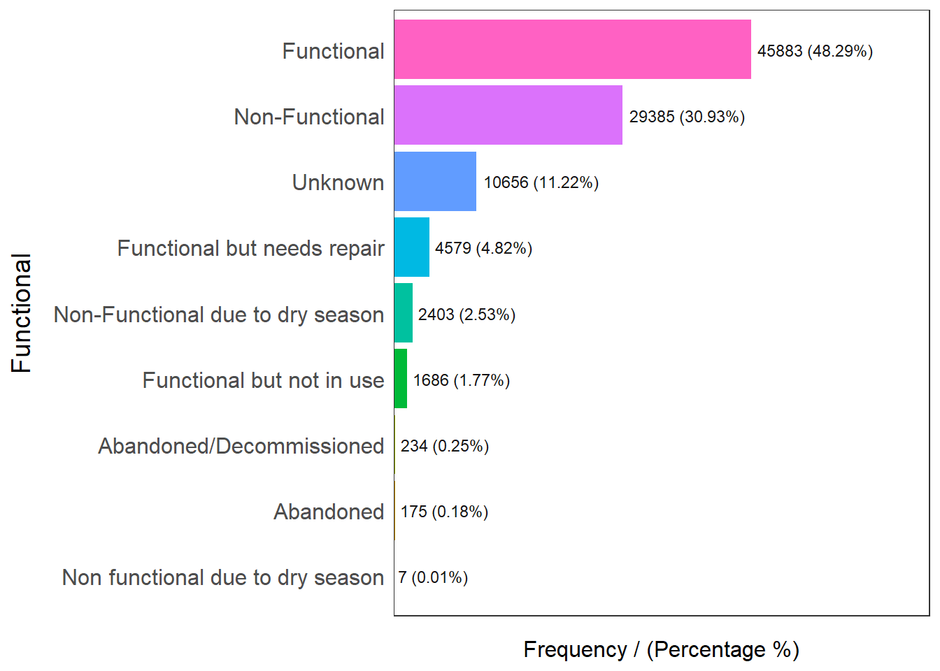
Functional frequency percentage cumulative_perc
1 Functional 45883 48.29 48.29
2 Non-Functional 29385 30.93 79.22
3 Unknown 10656 11.22 90.44
4 Functional but needs repair 4579 4.82 95.26
5 Non-Functional due to dry season 2403 2.53 97.79
6 Functional but not in use 1686 1.77 99.56
7 Abandoned/Decommissioned 234 0.25 99.81
8 Abandoned 175 0.18 99.99
9 Non functional due to dry season 7 0.01 100.00Checking out functionality, we know that functional water points are broken down into Functional, Functional but needs repair, and Functional but not in use.
48.29% are functional, 4.82% are functional but needs repair and 1.77% of them are functional but not in use. To aggregate the data, Abandoned and Decommissioned water points will be grouped as non functional water points
freq(data=nga_wp, input = 'Management')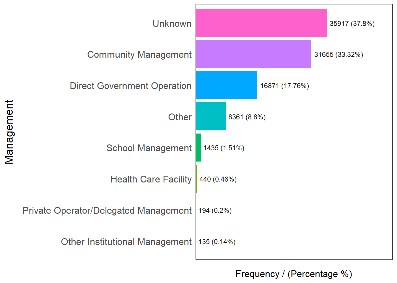
Management frequency percentage cumulative_perc
1 Unknown 35917 37.80 37.80
2 Community Management 31655 33.32 71.12
3 Direct Government Operation 16871 17.76 88.88
4 Other 8361 8.80 97.68
5 School Management 1435 1.51 99.19
6 Health Care Facility 440 0.46 99.65
7 Private Operator/Delegated Management 194 0.20 99.85
8 Other Institutional Management 135 0.14 100.00Checking out water point’s management, we know that more than half of the water points are managed except 37.8% which are unknowns
freq(data=nga_wp, input = 'Quality')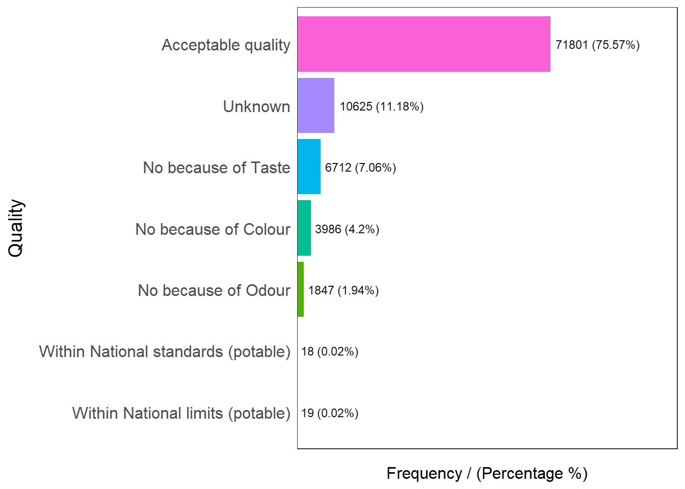
Quality frequency percentage cumulative_perc
1 Acceptable quality 71801 75.57 75.57
2 Unknown 10625 11.18 86.75
3 No because of Taste 6712 7.06 93.81
4 No because of Colour 3986 4.20 98.01
5 No because of Odour 1847 1.94 99.95
6 Within National limits (potable) 19 0.02 99.97
7 Within National standards (potable) 18 0.02 100.00Checking out the quality of water points, we know that 75.57% of them are of acceptable quality, with an additional 0.04% of them within potable national limits / standards. We will aggregate Acceptable Quality, Within National Standards (Potable) and Within National Limits (Potable) as Potable water in general for this analysis.
freq(data=nga_wp, input = 'Water_Source_Category')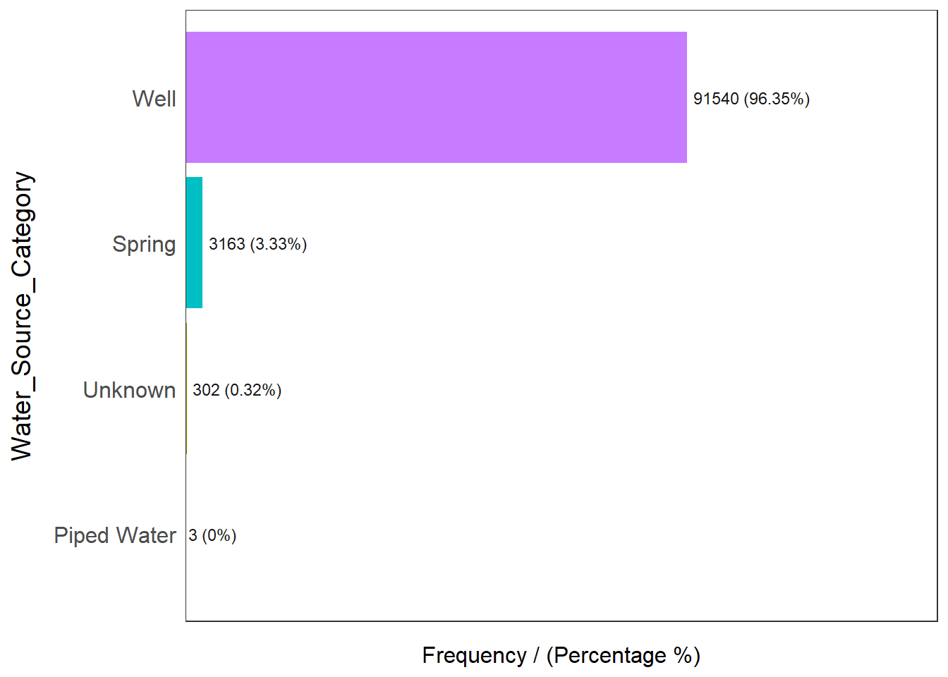
Water_Source_Category frequency percentage cumulative_perc
1 Well 91540 96.35 96.35
2 Spring 3163 3.33 99.68
3 Unknown 302 0.32 100.00
4 Piped Water 3 0.00 100.00Checking out the source of water points, we know that majority of them (96.35%) comes from some well. With such a high number, this variable may not be useful for our analysis as most of the data points will contain this value.
freq(data=nga_wp, input = 'Water_Tech_Category')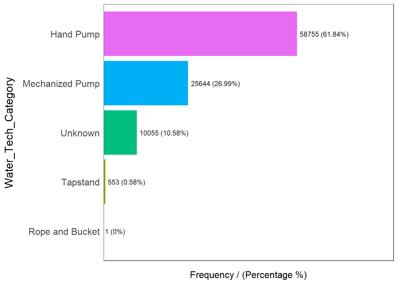
Water_Tech_Category frequency percentage cumulative_perc
1 Hand Pump 58755 61.84 61.84
2 Mechanized Pump 25644 26.99 88.83
3 Unknown 10055 10.58 99.41
4 Tapstand 553 0.58 99.99
5 Rope and Bucket 1 0.00 100.00Checking out the technology the water point uses, we know that water points are broken down into Hand pumps, Mechanized Pump, Tapstand, Rope and bucket. 61.84% of water points operates on hand pumps, 26.99% on mechanized pumps, 10.58% are unknowns and a minority of them (0.58%) are either on tapstand or Rope and Bucket.
freq(data=nga_wp, input = 'Is_Urban_Area')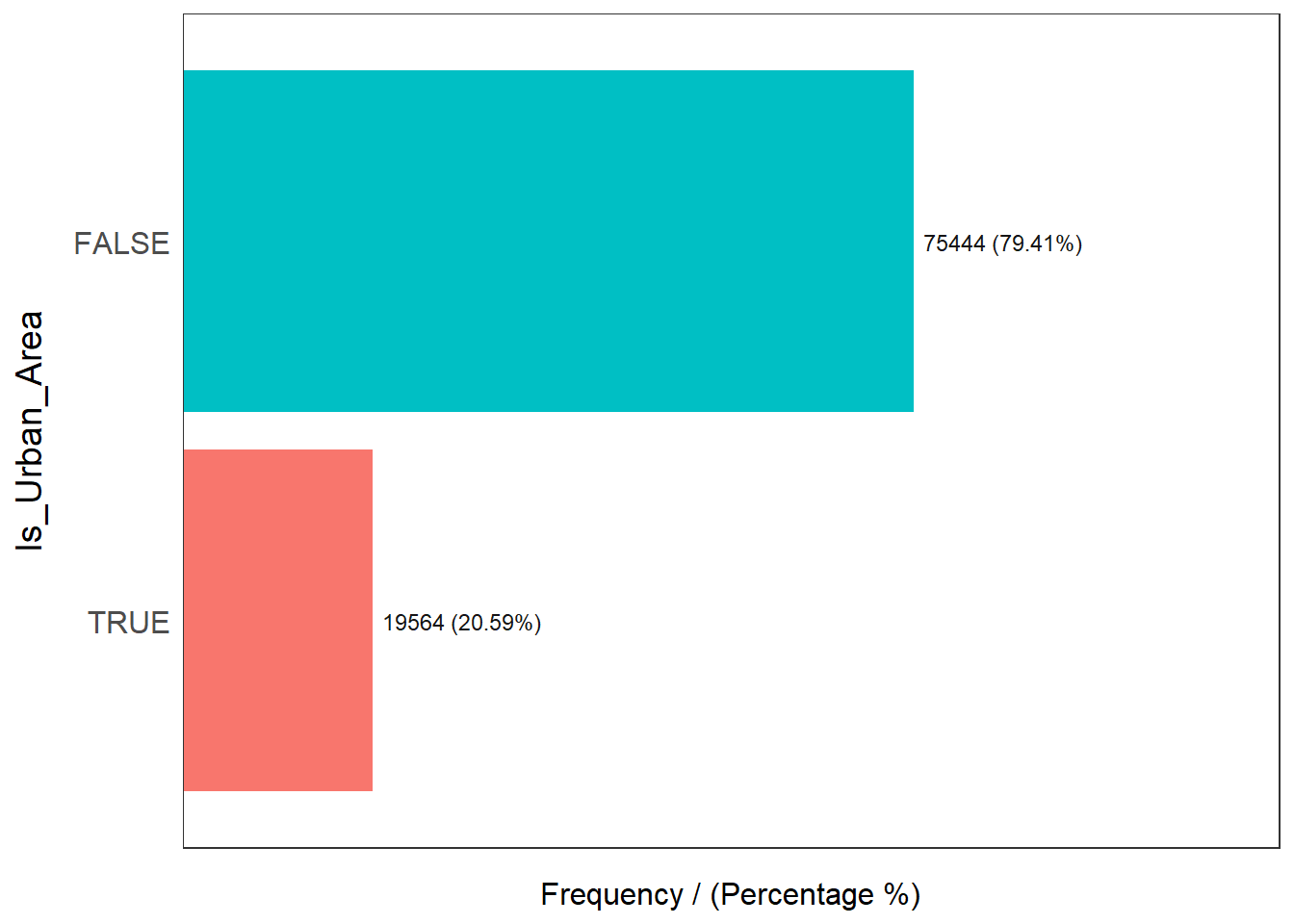
Is_Urban_Area frequency percentage cumulative_perc
1 FALSE 75444 79.41 79.41
2 TRUE 19564 20.59 100.00From the records, only 20.59% of the water points are in urban areas, while the rest of them (79.41%) are in the rural areas.
freq(data=nga_wp, input = 'usage_capacity')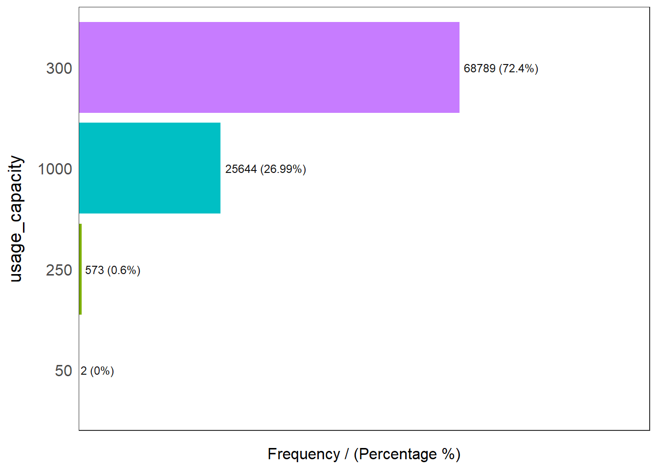
usage_capacity frequency percentage cumulative_perc
1 300 68789 72.40 72.40
2 1000 25644 26.99 99.39
3 250 573 0.60 99.99
4 50 2 0.00 100.00Majority of the water points caters to 300 people or less (73.1%), while 26.99% of the water points caters to a capacity of at least 1000 people
Continuous Variables
We will need to find out the summary of the respective distance in order to categorize them appropriately for analysis. We can achieve that by using summary statistics in R
summary(nga_wp$dist_to_primary_road) Min. 1st Qu. Median Mean 3rd Qu. Max.
0.01 1361.68 6647.50 10177.43 15132.29 82666.56 summary(nga_wp$dist_to_secondary_road) Min. 1st Qu. Median Mean 3rd Qu. Max.
0.0 788.6 4446.0 7934.7 11083.7 94773.0 summary(nga_wp$dist_to_tertiary_road) Min. 1st Qu. Median Mean 3rd Qu. Max.
0.0 261.5 1442.4 3853.2 5114.6 58874.0 Based on the results above, we know that the median distance (in km) to primary, secondary and tertiary roads is 6647.5 km, 4446.0 km and 1442.4 km respectively. We can use within median distance to analyze if accessibility to water points is a factor to regionalization
Aggregate the Data
To aggregate the variable of interest, we will create new data frames to store them by using the filter function. Variables names used are self explanatory.
func_list = c("Functional", "Functional but needs repair", "Functional but not in use")
wpt_functional_true = wpdx_clean_sf %>%
filter(Functional %in% func_list)
wpt_functional_false = wpdx_clean_sf %>%
filter(!Functional %in% c(func_list, "Unknown"))
wpt_rural = wpdx_clean_sf %>%
filter(Is_Urban_Area == FALSE)
wpt_handpumps_true = wpdx_clean_sf %>%
filter(Water_Tech_Category %in% "Hand Pump")
wpt_handpumps_false = wpdx_clean_sf %>%
filter(!Water_Tech_Category %in% "Hand Pump")
wpt_potable_true = wpdx_clean_sf %>%
filter(Quality %in% c("Acceptable quality", "Within National standards (potable)
", "Within National limits (potable)"))
wpt_potable_false = wpdx_clean_sf %>%
filter(!Quality %in% c("Acceptable quality", "Within National standards (potable)
", "Within National limits (potable)", "Unknown"))
wpt_potable_unknown = wpdx_clean_sf %>%
filter(!Quality %in% "Unknown")
wpt_usageOver1000 = wpdx_clean_sf %>%
filter(usage_capacity >= 1000)
wpt_usageUnder1000 = wpdx_clean_sf %>%
filter(usage_capacity < 1000)
wpt_accessibility_PriRd_lessThanMedian = wpdx_clean_sf %>%
filter(dist_to_primary_road < 6647.50)
wpt_accessibility_secRd_lessThanMedian = wpdx_clean_sf %>%
filter(dist_to_secondary_road < 4446.0 )
wpt_accessibility_TerRd_lessThanMedian = wpdx_clean_sf %>%
filter(dist_to_tertiary_road < 1442.4 )
wpt_managed_true = wpdx_clean_sf %>%
filter(!Management %in% "Unknown")
wpt_managed_unknown = wpdx_clean_sf %>%
filter(Management %in% "Unknown")Computing our data points of interest
We can use st_intersects() to find common data points between the geographical datasets. In our case, we need to find the common points in the Nigeria’s LGA spatial dataset and the water point aspatial dataset
As an example, the below code intersects the Nigeria LGA dataset (nga dataframe) with the water point dataset (wpdx_clean_sf dataframe) and produce a new column to denote the total number of water points in the area (Total wpt) by using mutate() and lengths()
nga_wp = nga %>%
#combine nga with water point sf
mutate(`total wpt` = lengths(
st_intersects(nga, wpdx_clean_sf)))Similarly, for the rest of the variables, we piped the output and add the new columns to denote the number of
water points are functional & non functional
Water points that are in rural areas
Water points that either uses Hand pumps or otherwise
Water points that have either potable or non potable water
Water points with usage capacity of over 1000 persons or under
Water points within Median distance of Primary, Secondary and Tertiary roads
Water points management that are managed
nga_wp = nga %>%
#combine nga with water point sf
mutate(`total wpt` = lengths(
st_intersects(nga, wpdx_clean_sf))) %>%
#add columns to produce no. of functional, non functional and unknown points
mutate(`wpt functional` = lengths(
st_intersects(nga, wpt_functional_true))) %>%
mutate(`wpt non functional` = lengths(
st_intersects(nga, wpt_functional_false))) %>%
# rural
mutate(`isRural` = lengths(
st_intersects(nga, wpt_rural))) %>%
# hand pumps
mutate(`Uses Handpumps` = lengths(
st_intersects(nga, wpt_handpumps_true))) %>%
# Potable
mutate(`Potable` = lengths(
st_intersects(nga, wpt_potable_true))) %>%
mutate(`Non Potable` = lengths(
st_intersects(nga, wpt_potable_false))) %>%
# Usage Capacity
mutate(`usage Over 1000` = lengths(
st_intersects(nga, wpt_usageOver1000))) %>%
mutate(`usage Under 1000` = lengths(
st_intersects(nga, wpt_usageUnder1000))) %>%
#Primary Road
mutate(`Within Median Distance to Pri Road` = lengths(
st_intersects(nga, wpt_accessibility_PriRd_lessThanMedian))) %>%
#Secondary Road
mutate(`Within Median Distance to Sec Road` = lengths(
st_intersects(nga, wpt_accessibility_secRd_lessThanMedian))) %>%
#Tertiary Road
mutate(`Within Median Distance to Ter Road` = lengths(
st_intersects(nga, wpt_accessibility_PriRd_lessThanMedian))) %>%
#management
mutate(`Managed` = lengths(
st_intersects(nga, wpt_managed_true))) Once we are done with the raw data, we use the below code to compute the respective percentages
percentage of functional water points
percentage of non functional water points
percentage of water points with hand pumps as technology
percentage of water points with potable / non potable water
percentage of water points with capacity over/under 1000
percentage of water points that are managed
percentage of water points in rural areas
percentage of water points are within the median distance to primary road network
percentage of water points are within the median distance to secondary road network
percentage of water points are within the median distance to tertiary road network
nga_wp = nga_wp %>%
#add columns to compute %
mutate(`pct_functional` = `wpt functional`/`total wpt`) %>%
mutate(`pct_non-functional` = `wpt non functional`/`total wpt`) %>%
mutate(`pct_Handpump` = `Uses Handpumps`/`total wpt`) %>%
mutate(`pct_Potable` = `Potable`/`total wpt`) %>%
mutate(`pct_NonPotable` = `Non Potable`/`total wpt`) %>%
mutate(`pct_Cap_Over_1000` = `usage Over 1000`/`total wpt`) %>%
mutate(`pct_Cap_Under_1000` = `usage Under 1000`/`total wpt`) %>%
mutate(`pct_managed` = `Managed`/`total wpt`) %>%
mutate(`pct_rural` = `isRural`/`total wpt`) %>%
mutate(`pct_w_meddist_to_PriRoad` = `Within Median Distance to Pri Road`/`total wpt`) %>%
mutate(`pct_w_meddist_to_SecRoad` = `Within Median Distance to Sec Road`/`total wpt`) %>%
mutate(`pct_w_meddist_to_TerRoad` = `Within Median Distance to Ter Road`/`total wpt`) Once we are done with adding the new columns, we can inspect the data by viewing the data frame. It can be observed that some rows contains NaN values as a result of division by zero. We will replace these NaN values to 0 with the is.na() function. We will also change the row names to the names of the LGAs with row.names() by using row.names()
nga_wp[is.na(nga_wp)] = 0
row.names(nga_wp) = nga_wp$shapeNameThe following variables will be retained as the rest are intermediate data points that are no longer relevant by using select(). We can verify that the columns are correct by using colnames()
wpt functional
wpt non functional
pct_functional
pct_non-functional
pct_Handpump
pct_Potable
pct_NonPotable
pct_Cap_Over_1000
pct_Cap_Under_1000
pct_managed
pct_rural
pct_w_meddist_to_PriRoad
pct_w_meddist_to_SecRoad
pct_w_meddist_to_TerRoad
nga_wp_interested_data_pts = nga_wp %>%
select(4:5, 16:27)
colnames(nga_wp_interested_data_pts)We save the processed data frame nga_wp_interested_data_pts into a file with saveRDS(), so that we do not need to process it again
saveRDS(nga_wp_interested_data_pts, "data/geospatial/nga_wp_interested_data_points.rds")We can then retrieve the saved RDS file using readRDS() and check that the column names are correct before we proceed further with colnames()
nga_wp_interested_data_pts = readRDS("data/geospatial/nga_wp_interested_data_points.rds")
colnames(nga_wp_interested_data_pts) [1] "wpt functional" "wpt non functional"
[3] "pct_functional" "pct_non-functional"
[5] "pct_Handpump" "pct_Potable"
[7] "pct_NonPotable" "pct_Cap_Over_1000"
[9] "pct_Cap_Under_1000" "pct_managed"
[11] "pct_rural" "pct_w_meddist_to_PriRoad"
[13] "pct_w_meddist_to_SecRoad" "pct_w_meddist_to_TerRoad"
[15] "geometry" EDA using statistical graphics
A Histogram is useful to identify the overall distribution of the data values (i.e. positively skew, negatively skew or normal distribution)
We use ggplot2’s histogram (geom_histogram) to plot the percentage functional and non functional water points with the mean and median as abline using geom_vline()
We plot them side by side using ggarrange
functional_pct_histo = ggplot(data=nga_wp_interested_data_pts,
aes(x= `pct_functional`)) +
geom_histogram(bins=20,
color="black",
fill="light green") +
labs(x = "% Functional", y = "Frequency") +
geom_vline(aes(xintercept = mean(nga_wp_interested_data_pts$pct_functional)),
color="red", linetype="dashed", linewidth=1) +
geom_vline(aes(xintercept=median(nga_wp_interested_data_pts$pct_functional)),
color="brown", linetype="dashed", linewidth=1)
nonfunctional_pct_histo = ggplot(data=nga_wp_interested_data_pts,
aes(x= `pct_non-functional`)) +
geom_histogram(bins=20,
color="black",
fill="light green") +
labs(x = "% Non Functional", y = "Frequency") +
geom_vline(aes(xintercept = mean(nga_wp_interested_data_pts$`pct_non-functional` )),
color="red", linetype="dashed", linewidth=1) +
geom_vline(aes(xintercept=median(nga_wp_interested_data_pts$`pct_non-functional`)),
color="brown", linetype="dashed", linewidth=1)
ggarrange(functional_pct_histo, nonfunctional_pct_histo, ncol = 2, nrow = 1)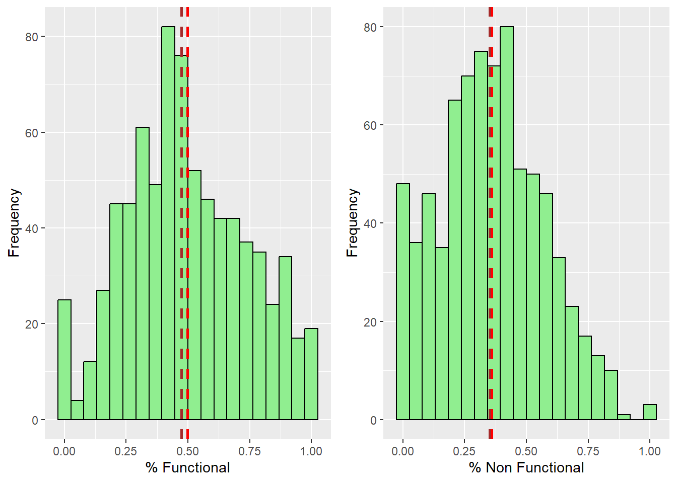
From the result, we can observe that both functional and non functional water points distributions are positively skewed. It follows a normal distribution with its mean and median very close to each other.
We can also use box plot to detect outliers with geom_boxplot. We plot them side by side using ggarrange
functional_boxplot = ggplot(data=nga_wp_interested_data_pts,
aes(x=`pct_functional`)) +
labs(x = "% Functional") +
geom_boxplot(color="black", fill="light green")
nonfunctional_boxplot = ggplot(data=nga_wp_interested_data_pts,
aes(x=`pct_non-functional`)) +
labs(x = "% Non Functional") +
geom_boxplot(color="black", fill="light green")
ggarrange(functional_boxplot, nonfunctional_boxplot, ncol = 2, nrow = 1)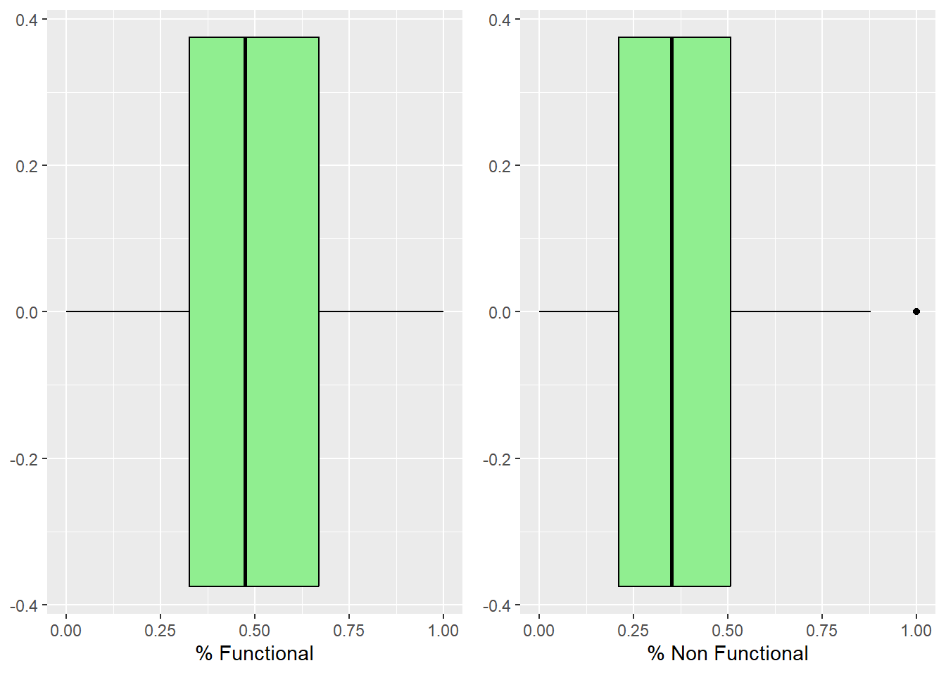
We can see that there isn’t any outliers for the functional water points, but for non functional water points, there are outliers where 100% of the water points are non functional.
In the figure below, multiple histograms are plotted to reveal the distribution of the selected variables in the nga_wp_interested_data_pts data frame.
First, We do this by creating all the histograms assigned to individual variables by using ggplot().
functional = ggplot(data=nga_wp_interested_data_pts,
aes(x= `wpt functional`)) +
geom_histogram(bins=20,
color="black",
fill="light green") +
labs(x = "No. of Functional", y = "Frequency") +
geom_vline(aes(xintercept = mean(nga_wp_interested_data_pts$`wpt functional`)),
color="red", linetype="dashed", linewidth=1) +
geom_vline(aes(xintercept=median(nga_wp_interested_data_pts$`wpt functional`)), color="brown", linetype="dashed", linewidth=1)
nonfunctional = ggplot(data=nga_wp_interested_data_pts,
aes(x= `wpt non functional`)) +
geom_histogram(bins=20,
color="black",
fill="light green") +
labs(x = "No. of Non Functional", y = "Frequency") +
geom_vline(aes(xintercept = mean(nga_wp_interested_data_pts$`wpt non functional` )),color="red", linetype="dashed", linewidth=1) +
geom_vline(aes(xintercept=median(nga_wp_interested_data_pts$`wpt non functional`)),color="brown", linetype="dashed", linewidth=1)
functional_pct = ggplot(data=nga_wp_interested_data_pts,
aes(x= `pct_functional`)) +
geom_histogram(bins=20,
color="black",
fill="light green") +
labs(x = "% Functional", y = "Frequency") +
geom_vline(aes(xintercept = mean(nga_wp_interested_data_pts$`pct_functional` )),color="red", linetype="dashed", linewidth=1) +
geom_vline(aes(xintercept=median(nga_wp_interested_data_pts$`pct_functional`)), color="brown", linetype="dashed", linewidth=1)
nonfunctional_pct = ggplot(data=nga_wp_interested_data_pts,
aes(x= `pct_non-functional`)) +
geom_histogram(bins=20,
color="black",
fill="light green") +
labs(x = "% Non Functional", y = "Frequency") +
geom_vline(aes(xintercept = mean(nga_wp_interested_data_pts$`pct_non-functional` )),
color="red", linetype="dashed", linewidth=1) +
geom_vline(aes(xintercept=median(nga_wp_interested_data_pts$`pct_non-functional`)),
color="brown", linetype="dashed", linewidth=1)
pct_Handpump = ggplot(data=nga_wp_interested_data_pts,
aes(x= `pct_Handpump`)) +
geom_histogram(bins=20,
color="black",
fill="light green") +
labs(x = "% Handpump", y = "Frequency") +
geom_vline(aes(xintercept = mean(nga_wp_interested_data_pts$`pct_Handpump` )),
color="red", linetype="dashed", linewidth=1) +
geom_vline(aes(xintercept=median(nga_wp_interested_data_pts$`pct_Handpump`)),
color="brown", linetype="dashed", linewidth=1)
pct_Potable = ggplot(data=nga_wp_interested_data_pts,
aes(x= `pct_Potable`)) +
geom_histogram(bins=20,
color="black",
fill="light green") +
labs(x = "% Potable", y = "Frequency") +
geom_vline(aes(xintercept = mean(nga_wp_interested_data_pts$`pct_Potable` )),
color="red", linetype="dashed", linewidth=1) +
geom_vline(aes(xintercept=median(nga_wp_interested_data_pts$`pct_Potable`)),
color="brown", linetype="dashed", linewidth=1)
pct_NonPotable = ggplot(data=nga_wp_interested_data_pts,
aes(x= `pct_NonPotable`)) +
geom_histogram(bins=20,
color="black",
fill="light green") +
labs(x = "% Non Potable", y = "Frequency") +
geom_vline(aes(xintercept = mean(nga_wp_interested_data_pts$`pct_NonPotable` )), color="red", linetype="dashed", linewidth=1) +
geom_vline(aes(xintercept=median(nga_wp_interested_data_pts$`pct_NonPotable`)), color="brown", linetype="dashed", linewidth=1)
pct_Usage_Capacity_Over_1000 = ggplot(data=nga_wp_interested_data_pts,
aes(x= `pct_Cap_Over_1000`)) +
geom_histogram(bins=20,
color="black",
fill="light green") +
labs(x = "% Usage capacity >= 1000", y = "Frequency") +
geom_vline(aes(xintercept = mean(nga_wp_interested_data_pts$`pct_Cap_Over_1000` )),
color="red", linetype="dashed", linewidth=1) +
geom_vline(aes(xintercept=median(nga_wp_interested_data_pts$`pct_Cap_Over_1000`)),
color="brown", linetype="dashed", linewidth=1)
pct_Usage_Capacity_Under_1000 = ggplot(data=nga_wp_interested_data_pts,
aes(x= `pct_Cap_Under_1000`)) +
geom_histogram(bins=20,
color="black",
fill="light green") +
labs(x = "% Usage capacity < 1000", y = "Frequency") +
geom_vline(aes(xintercept = mean(nga_wp_interested_data_pts$`pct_Cap_Under_1000` )),
color="red", linetype="dashed", linewidth=1) +
geom_vline(aes(xintercept=median(nga_wp_interested_data_pts$`pct_Cap_Under_1000`)),
color="brown", linetype="dashed", linewidth=1)
pct_managed = ggplot(data=nga_wp_interested_data_pts,
aes(x= `pct_managed`)) +
geom_histogram(bins=20,
color="black",
fill="light green") +
labs(x = "% Managed", y = "Frequency") +
geom_vline(aes(xintercept = mean(nga_wp_interested_data_pts$`pct_managed` )),
color="red", linetype="dashed", linewidth=1) +
geom_vline(aes(xintercept=median(nga_wp_interested_data_pts$`pct_managed`)),
color="brown", linetype="dashed", linewidth=1)
pct_rural = ggplot(data=nga_wp_interested_data_pts,
aes(x= `pct_rural`)) +
geom_histogram(bins=20,
color="black",
fill="light green") +
labs(x = "% Rural", y = "Frequency") +
geom_vline(aes(xintercept = mean(nga_wp_interested_data_pts$`pct_rural` )),
color="red", linetype="dashed", linewidth=1) +
geom_vline(aes(xintercept=median(nga_wp_interested_data_pts$`pct_rural`)),
color="brown", linetype="dashed", linewidth=1)
pct_within_median_dist_to_pri_road = ggplot(data=nga_wp_interested_data_pts,
aes(x= `pct_w_meddist_to_PriRoad`)) +
geom_histogram(bins=20,
color="black",
fill="light green") +
labs(x = "% Within Median distance to Primary Road",
y = "Frequency") +
geom_vline(aes(xintercept = mean(nga_wp_interested_data_pts$`pct_w_meddist_to_PriRoad` )),
color="red", linetype="dashed", linewidth=1) +
geom_vline(aes(xintercept=median(nga_wp_interested_data_pts$`pct_w_meddist_to_PriRoad`)),
color="brown", linetype="dashed", linewidth=1)
pct_within_median_dist_to_sec_road = ggplot(data=nga_wp_interested_data_pts,
aes(x= `pct_w_meddist_to_SecRoad`)) +
geom_histogram(bins=20,
color="black",
fill="light green") +
labs(x = "% Within Median distance to Secondary Road",
y = "Frequency") +
geom_vline(aes(xintercept = mean(nga_wp_interested_data_pts$`pct_w_meddist_to_SecRoad` )),
color="red", linetype="dashed", linewidth=1) +
geom_vline(aes(xintercept=median(nga_wp_interested_data_pts$`pct_w_meddist_to_SecRoad`)),
color="brown", linetype="dashed", linewidth=1)
pct_within_median_dist_to_ter_road = ggplot(data=nga_wp_interested_data_pts,
aes(x= `pct_w_meddist_to_TerRoad`)) +
geom_histogram(bins=20,
color="black",
fill="light green") +
labs(x = "% Within Median distance to Tertiary Road",
y = "Frequency") +
geom_vline(aes(xintercept = mean(nga_wp_interested_data_pts$`pct_w_meddist_to_TerRoad` )),
color="red", linetype="dashed", linewidth=1) +
geom_vline(aes(xintercept=median(nga_wp_interested_data_pts$`pct_w_meddist_to_TerRoad`)),
color="brown", linetype="dashed", linewidth=1)We can build a trellis plot with the code below after creating our graphs with ggarrange() to create 14 histograms. and organised them into a 3 columns by 5 rows small multiplot.
ggarrange(functional, nonfunctional,
functional_pct, nonfunctional_pct,
pct_Potable, pct_NonPotable,
pct_Usage_Capacity_Over_1000, pct_Usage_Capacity_Under_1000,
pct_managed, pct_rural,
pct_within_median_dist_to_pri_road,
pct_within_median_dist_to_sec_road,
pct_within_median_dist_to_ter_road,
pct_Handpump,
ncol = 3, nrow = 5)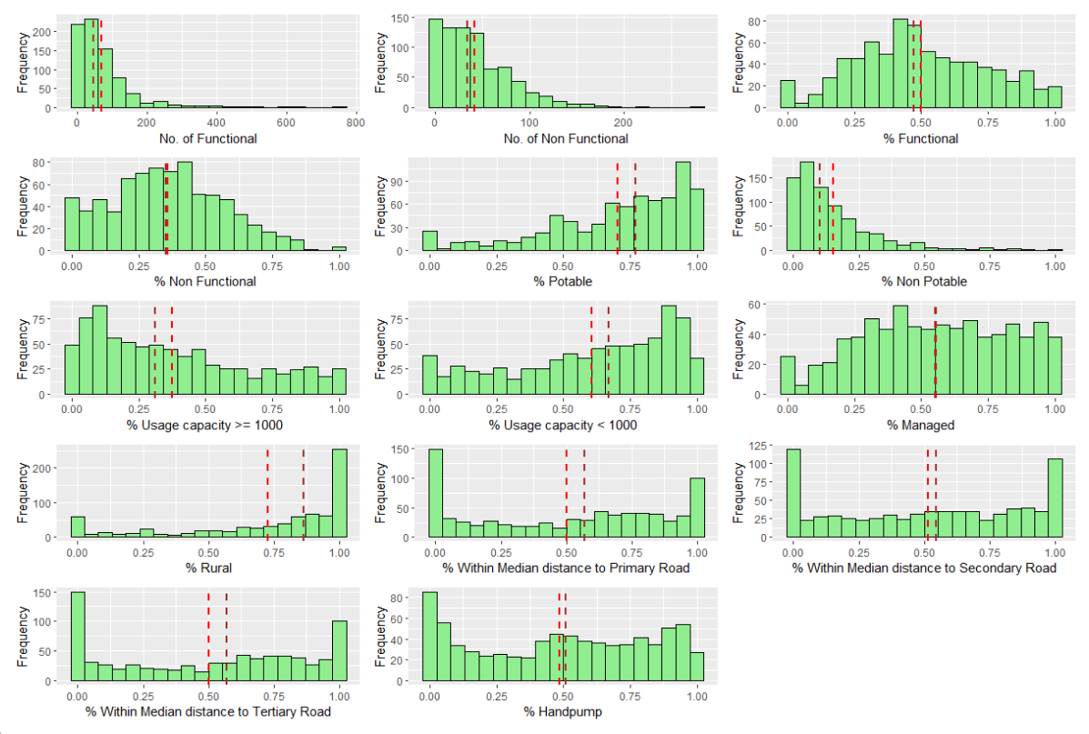
From the Trellis plot, we can observe that most of the variables does not follow a Normal Distribution, except for % functional and % non functional.
As number of functional and number of non functional water points are NOT in the same units as the other variables in percentage, we will need to standardize them later.
Visualizing the spatial distribution of water points
We will plot the map with the tmap package. In this exercise we will use the jenks style as it looks for clusters of related values and highlights the differences between categories. (Nowosad, 2019)
nga_wp_interested_data_pts.map.pct_func =
tm_shape(nga_wp_interested_data_pts) +
tm_fill("pct_functional",
palette ="PuRd", style="jenks", n = 5) +
tm_borders(alpha=0.5) +
tm_grid (alpha=0.2) +
tm_view(set.zoom.limits = c(5,10)) +
tm_layout(main.title="% functional WP",
main.title.position="center",
main.title.size=0.8,
frame = TRUE)
nga_wp_interested_data_pts.map.pct_nonfunc =
tm_shape(nga_wp_interested_data_pts) +
tm_fill("pct_non-functional",
palette ="PuRd", style="jenks", n = 5) +
tm_borders(alpha=0.5) +
tm_grid (alpha=0.2) +
tm_view(set.zoom.limits = c(5,10)) +
tm_layout(main.title="% non functional WP",
main.title.position="center",
main.title.size=0.8,
frame = TRUE)
tmap_arrange(nga_wp_interested_data_pts.map.pct_func,
nga_wp_interested_data_pts.map.pct_nonfunc,
asp=1, ncol=2, sync = TRUE)From the results, we can observe the following:
The north east area of Nigeria have little to no water point at all
Functional water points congregate in the northern side of the country
Non functional water points congregates around the south western coast of Nigera, facing gulf of Guinea & Bight of Benin.
Correlation Analysis
Finding Correlated Variables
It is important that we ensure the cluster variables are not highly correlated before we conduct cluster analysis.
We will first remove the geometry object from the data frame using st_set_geometry(NULL)
nga_wp_corr_vars = nga_wp_interested_data_pts %>%
st_set_geometry(NULL)We will use corrplot.mixed() (ref) function of the corrplot package. However we need to find the correlation matrix first with cor()
cluster_vars.cor = cor(nga_wp_corr_vars)
corrplot.mixed(cluster_vars.cor,
lower = "ellipse",
upper = "number",
tl.pos = "lt",
diag="l",
tl.col="black")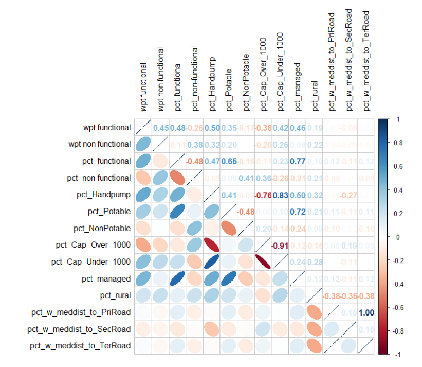
According to Calkins (2005), variables that can be regarded as having a high degree of correlation are indicated by correlation coefficients with magnitudes between ± 0.7 and 1.0.
As a result, the following 5 observations are highly correlated:
pct_functional vs. pct_managed - we will drop pct_managed
pct_handpump vs. pct_Cap_Over1000 and pct_Cap_Under1000 - we will drop pct_Cap_Over1000 and pct_handpump
pct_potable vs. pct managed - pct_managed already drop in 1
pct_Cap_Over_1000 vs. pct_Cap_Under1000 - pct_Cap_Over1000 already drop in 2
pct_w_meddist_to_PriRoad vs. pct_w_meddist_to_TerRoad - we will drop pct_w_meddist_to_TerRoad
In conclusion, we will drop pct_handpump (Column 5), pct_managed (Column 10), pct_Cap_Over1000 (Column 8), and pct_w_meddist_to_TerRoad (Column 14). Using select(), we drop the respective columns.
At the end of it, we verify that the column names that are retained are correct by using colnames()
nga_wp_corr_vars = nga_wp_corr_vars %>%
select(-5, -10, -8, -14)
colnames(nga_wp_corr_vars) [1] "wpt functional" "wpt non functional"
[3] "pct_functional" "pct_non-functional"
[5] "pct_Potable" "pct_NonPotable"
[7] "pct_Cap_Under_1000" "pct_rural"
[9] "pct_w_meddist_to_PriRoad" "pct_w_meddist_to_SecRoad"Data Standardization
As most of the data points are already in percentages except wpt functional and wpt non functional, we will need to perform standardization so that they will be comparable.
From the Trellis plot generated earlier, we know that not all of the variables follow some normal distribution, so we will use Min-Max standardization instead of the Z-score standardization in this exercise.
To achieve that we can use the heatmaply package’s normalize() function. The summary() function is used to show the summary statistics for the standardized clustering variables.
nga_wp_corr_vars.std_minmax = normalize(nga_wp_corr_vars)
summary(nga_wp_corr_vars.std_minmax) wpt functional wpt non functional pct_functional pct_non-functional
Min. :0.00000 Min. :0.00000 Min. :0.0000 Min. :0.0000
1st Qu.:0.02261 1st Qu.:0.04406 1st Qu.:0.3261 1st Qu.:0.2105
Median :0.06051 Median :0.12230 Median :0.4741 Median :0.3505
Mean :0.08957 Mean :0.14962 Mean :0.4984 Mean :0.3592
3rd Qu.:0.11669 3rd Qu.:0.21853 3rd Qu.:0.6699 3rd Qu.:0.5076
Max. :1.00000 Max. :1.00000 Max. :1.0000 Max. :1.0000
pct_Potable pct_NonPotable pct_Cap_Under_1000 pct_rural
Min. :0.0000 Min. :0.00000 Min. :0.0000 Min. :0.0000
1st Qu.:0.5425 1st Qu.:0.03799 1st Qu.:0.3968 1st Qu.:0.5727
Median :0.7706 Median :0.10060 Median :0.6703 Median :0.8645
Mean :0.7048 Mean :0.15343 Mean :0.6078 Mean :0.7271
3rd Qu.:0.9200 3rd Qu.:0.21003 3rd Qu.:0.8735 3rd Qu.:1.0000
Max. :1.0000 Max. :1.00000 Max. :1.0000 Max. :1.0000
pct_w_meddist_to_PriRoad pct_w_meddist_to_SecRoad
Min. :0.0000 Min. :0.0000
1st Qu.:0.1038 1st Qu.:0.1745
Median :0.5679 Median :0.5455
Mean :0.5017 Mean :0.5160
3rd Qu.:0.8305 3rd Qu.:0.8547
Max. :1.0000 Max. :1.0000 We can see that the values range of the Min-max standardized clustering variables are between 0 and 1 now.
Visualizing the standardize clustering variables
It is a good idea to visualize the distribution graphical of the standardized clustering variables in addition to evaluating the summary statistics of those variables. We will use the ggplot2 library to help us with that by plotting the raw variable distribution vs the standardized distribution
r_func = ggplot(data=nga_wp_interested_data_pts, aes(x=`wpt functional`)) +
geom_histogram(bins=20, color="black", fill="light green") +
labs(x = "Functional", y = "Frequency") +
geom_vline(aes(xintercept = mean(nga_wp_interested_data_pts$`wpt functional`)),
color="red", linetype="dashed", linewidth=1) +
geom_vline(aes(xintercept=median(nga_wp_interested_data_pts$`wpt functional`)),
color="brown", linetype="dashed", linewidth=1)
s_func = ggplot(data=nga_wp_corr_vars.std_minmax, aes(x=`wpt functional`)) +
geom_histogram(bins=20, color="black", fill="light green") +
labs(x = "Functional", y = "Frequency") +
geom_vline(aes(xintercept = mean(nga_wp_corr_vars.std_minmax$`wpt functional`)),
color="red", linetype="dashed", linewidth=1) +
geom_vline(aes(xintercept=median(nga_wp_corr_vars.std_minmax$`wpt functional`)),
color="brown", linetype="dashed", linewidth=1) + ggtitle("Min-Max Standardization")
r_nfunc = ggplot(data=nga_wp_interested_data_pts, aes(x=`wpt non functional`)) +
geom_histogram(bins=20, color="black", fill="light green") +
labs(x = "Non Functional", y = "Frequency") +
geom_vline(aes(xintercept = mean(nga_wp_interested_data_pts$`wpt non functional`)),
color="red", linetype="dashed", linewidth=1) +
geom_vline(aes(xintercept=median(nga_wp_interested_data_pts$`wpt non functional`)),
color="brown", linetype="dashed", linewidth=1)
s_nfunc = ggplot(data=nga_wp_corr_vars.std_minmax, aes(x=`wpt non functional`)) +
geom_histogram(bins=20, color="black", fill="light green") +
labs(x = "Non Functional", y = "Frequency") +
geom_vline(aes(xintercept = mean(nga_wp_corr_vars.std_minmax$`wpt non functional`)),
color="red", linetype="dashed", linewidth=1) +
geom_vline(aes(xintercept=median(nga_wp_corr_vars.std_minmax$`wpt non functional`)),
color="brown", linetype="dashed", linewidth=1) + ggtitle("Min-Max Standardization")
ggarrange(r_func, s_func, r_nfunc, s_nfunc,
ncol = 2,
nrow = 2)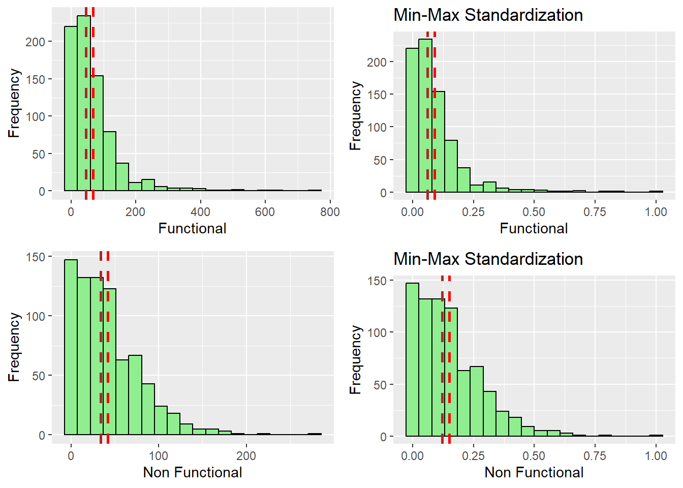
r_pctFunc = ggplot(data=nga_wp_interested_data_pts, aes(x=`pct_functional`)) +
geom_histogram(bins=20, color="black", fill="light green") +
labs(x = "% Functional", y = "Frequency") +
geom_vline(aes(xintercept = mean(nga_wp_interested_data_pts$`pct_functional`)),
color="red", linetype="dashed", linewidth=1) +
geom_vline(aes(xintercept=median(nga_wp_interested_data_pts$`pct_functional`)),
color="brown", linetype="dashed", linewidth=1)
s_pctFunc = ggplot(data=nga_wp_corr_vars.std_minmax, aes(x=`pct_functional`)) +
geom_histogram(bins=20, color="black", fill="light green") +
labs(x = "% Functional", y = "Frequency") +
geom_vline(aes(xintercept = mean(nga_wp_corr_vars.std_minmax$`pct_functional`)),
color="red", linetype="dashed", linewidth=1) +
geom_vline(aes(xintercept=median(nga_wp_corr_vars.std_minmax$`pct_functional`)),
color="brown", linetype="dashed", linewidth=1) + ggtitle("Min-Max Standardization")
r_pctNfunc = ggplot(data=nga_wp_interested_data_pts, aes(x=`pct_non-functional`)) +
geom_histogram(bins=20, color="black", fill="light green") +
labs(x = "% Non Functional", y = "Frequency") +
geom_vline(aes(xintercept = mean(nga_wp_interested_data_pts$`pct_non-functional`)),
color="red", linetype="dashed", linewidth=1) +
geom_vline(aes(xintercept=median(nga_wp_interested_data_pts$`pct_non-functional`)),
color="brown", linetype="dashed", linewidth=1)
s_pctNfunc = ggplot(data=nga_wp_corr_vars.std_minmax, aes(x=`pct_non-functional`)) +
geom_histogram(bins=20, color="black", fill="light green") +
labs(x = "% Non Functional", y = "Frequency") +
geom_vline(aes(xintercept = mean(nga_wp_corr_vars.std_minmax$`pct_non-functional`)),
color="red", linetype="dashed", linewidth=1) +
geom_vline(aes(xintercept=median(nga_wp_corr_vars.std_minmax$`wpt non functional`)),
color="brown", linetype="dashed", linewidth=1) + ggtitle("Min-Max Standardization")
ggarrange(r_pctFunc, s_pctFunc, r_pctNfunc,s_pctNfunc,
ncol = 2,
nrow = 2)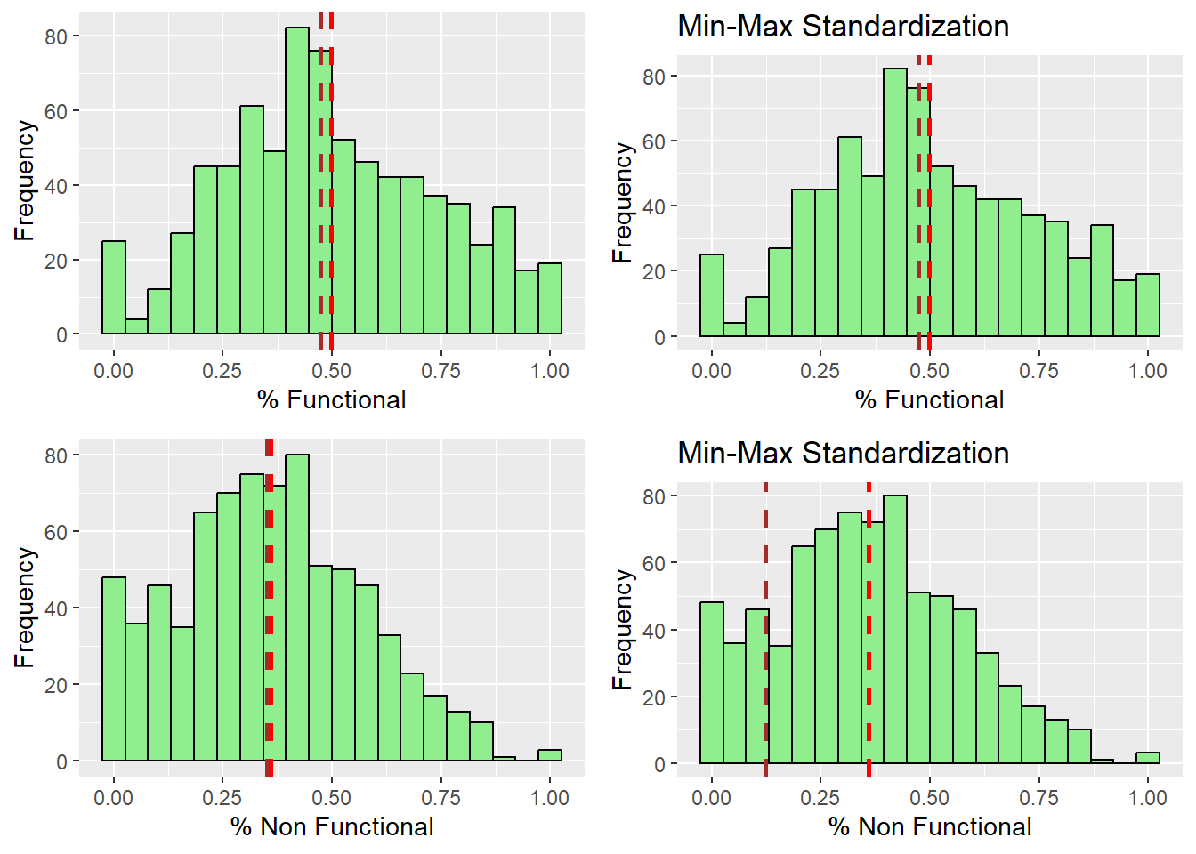
r_potable = ggplot(data=nga_wp_interested_data_pts, aes(x=`pct_Potable`)) +
geom_histogram(bins=20, color="black", fill="light green") +
labs(x = "% Potable", y = "Frequency") +
geom_vline(aes(xintercept = mean(nga_wp_interested_data_pts$`pct_Potable`)),
color="red", linetype="dashed", linewidth=1) +
geom_vline(aes(xintercept=median(nga_wp_interested_data_pts$`pct_Potable`)),
color="brown", linetype="dashed", linewidth=1)
s_potable = ggplot(data=nga_wp_corr_vars.std_minmax, aes(x=`pct_Potable`)) +
geom_histogram(bins=20, color="black", fill="light green") +
labs(x = "% Potable", y = "Frequency") +
geom_vline(aes(xintercept = mean(nga_wp_corr_vars.std_minmax$`pct_Potable`)),
color="red", linetype="dashed", linewidth=1) +
geom_vline(aes(xintercept=median(nga_wp_corr_vars.std_minmax$`pct_Potable`)),
color="brown", linetype="dashed", linewidth=1) + ggtitle("Min-Max Standardization")
r_nonpotable = ggplot(data=nga_wp_interested_data_pts, aes(x=`pct_NonPotable`)) +
geom_histogram(bins=20, color="black", fill="light green") +
labs(x = "% Non Potable", y = "Frequency") +
geom_vline(aes(xintercept = mean(nga_wp_interested_data_pts$`pct_NonPotable`)),
color="red", linetype="dashed", linewidth=1) +
geom_vline(aes(xintercept=median(nga_wp_interested_data_pts$`pct_NonPotable`)),
color="brown", linetype="dashed", linewidth=1)
s_nonpotable = ggplot(data=nga_wp_corr_vars.std_minmax, aes(x=`pct_NonPotable`)) +
geom_histogram(bins=20, color="black", fill="light green") +
labs(x = "% Non Potable", y = "Frequency") +
geom_vline(aes(xintercept = mean(nga_wp_corr_vars.std_minmax$`pct_NonPotable`)),
color="red", linetype="dashed", linewidth=1) +
geom_vline(aes(xintercept=median(nga_wp_corr_vars.std_minmax$`pct_NonPotable`)),
color="brown", linetype="dashed", linewidth=1) + ggtitle("Min-Max Standardization")
ggarrange(r_potable, s_potable, r_nonpotable, s_nonpotable,
ncol = 2,
nrow = 2)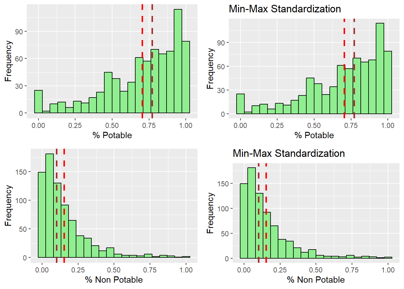
r_capUnder1000 = ggplot(data=nga_wp_interested_data_pts, aes(x=`pct_Cap_Under_1000`)) +
geom_histogram(bins=20, color="black", fill="light green") +
labs(x = "% Usage Capacity < 1000", y = "Frequency") +
geom_vline(aes(xintercept = mean(nga_wp_interested_data_pts$`pct_Cap_Under_1000`)),
color="red", linetype="dashed", linewidth=1) +
geom_vline(aes(xintercept=median(nga_wp_interested_data_pts$`pct_Cap_Under_1000`)),
color="brown", linetype="dashed", linewidth=1)
s_capUnder1000 = ggplot(data=nga_wp_corr_vars.std_minmax, aes(x=`pct_Cap_Under_1000`)) +
geom_histogram(bins=20, color="black", fill="light green") +
labs(x = "% Usage Capacity < 1000", y = "Frequency") +
geom_vline(aes(xintercept = mean(nga_wp_corr_vars.std_minmax$`pct_Cap_Under_1000`)),
color="red", linetype="dashed", linewidth=1) +
geom_vline(aes(xintercept=median(nga_wp_corr_vars.std_minmax$`pct_Cap_Under_1000`)),
color="brown", linetype="dashed", linewidth=1) + ggtitle("Min-Max Standardization")
r_rural = ggplot(data=nga_wp_interested_data_pts, aes(x=`pct_rural`)) +
geom_histogram(bins=20, color="black", fill="light green") +
labs(x = "% Rural", y = "Frequency") +
geom_vline(aes(xintercept = mean(nga_wp_interested_data_pts$`pct_rural`)),
color="red", linetype="dashed", linewidth=1) +
geom_vline(aes(xintercept=median(nga_wp_interested_data_pts$`pct_rural`)),
color="brown", linetype="dashed", linewidth=1)
s_rural = ggplot(data=nga_wp_corr_vars.std_minmax, aes(x=`pct_rural`)) +
geom_histogram(bins=20, color="black", fill="light green") +
labs(x = "% Rural", y = "Frequency") +
geom_vline(aes(xintercept = mean(nga_wp_corr_vars.std_minmax$`pct_rural`)),
color="red", linetype="dashed", linewidth=1) +
geom_vline(aes(xintercept=median(nga_wp_corr_vars.std_minmax$`pct_rural`)),
color="brown", linetype="dashed", linewidth=1) + ggtitle("Min-Max Standardization")
ggarrange(r_capUnder1000, s_capUnder1000, r_rural, s_rural ,
ncol = 2,
nrow = 2)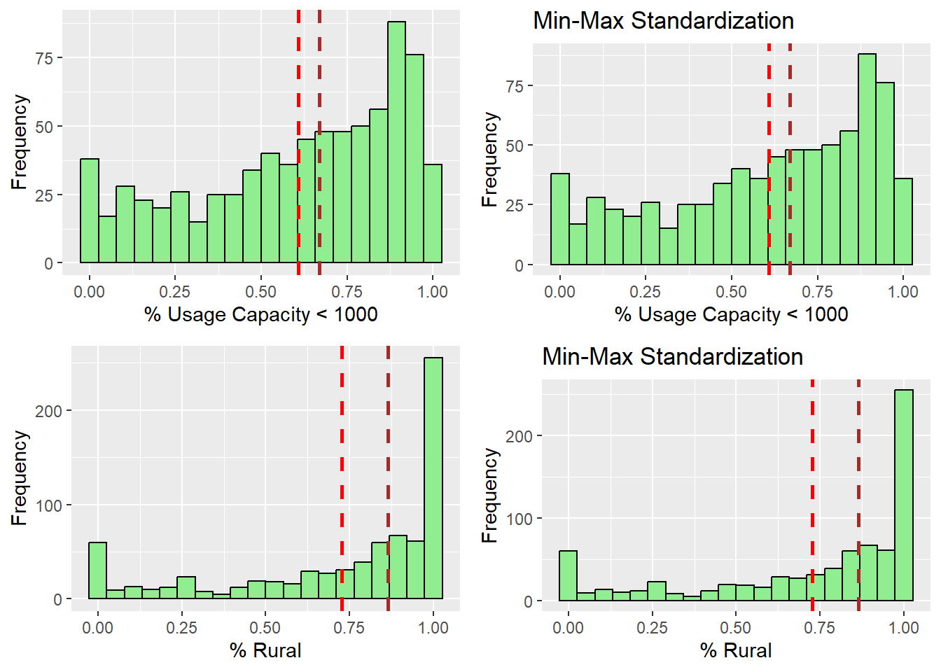
r_w_dist_toPriRoad = ggplot(data=nga_wp_interested_data_pts, aes(x=`pct_w_meddist_to_PriRoad`)) +
geom_histogram(bins=20, color="black", fill="light green") +
labs(x = "% Within Med Dist to Pri Road", y = "Frequency") +
geom_vline(aes(xintercept = mean(nga_wp_interested_data_pts$`pct_w_meddist_to_PriRoad`)),
color="red", linetype="dashed", linewidth=1) +
geom_vline(aes(xintercept=median(nga_wp_interested_data_pts$`pct_w_meddist_to_PriRoad`)),
color="brown", linetype="dashed", linewidth=1)
s_w_dist_toPriRoad = ggplot(data=nga_wp_corr_vars.std_minmax, aes(x=`pct_w_meddist_to_PriRoad`)) +
geom_histogram(bins=20, color="black", fill="light green") +
labs(x = "% Within Med Dist to Pri Road", y = "Frequency") +
geom_vline(aes(xintercept = mean(nga_wp_corr_vars.std_minmax$`pct_w_meddist_to_PriRoad`)),
color="red", linetype="dashed", linewidth=1) +
geom_vline(aes(xintercept=median(nga_wp_corr_vars.std_minmax$`pct_w_meddist_to_PriRoad`)),
color="brown", linetype="dashed", linewidth=1) + ggtitle("Min-Max Standardization")
r_w_dist_toSecRoad = ggplot(data=nga_wp_interested_data_pts, aes(x=`pct_w_meddist_to_SecRoad`)) +
geom_histogram(bins=20, color="black", fill="light green") +
labs(x = "% Within Med Dist to Sec Road", y = "Frequency") +
geom_vline(aes(xintercept = mean(nga_wp_interested_data_pts$`pct_w_meddist_to_SecRoad`)),
color="red", linetype="dashed", linewidth=1) +
geom_vline(aes(xintercept=median(nga_wp_interested_data_pts$`pct_w_meddist_to_SecRoad`)),
color="brown", linetype="dashed", linewidth=1)
s_w_dist_toSecRoad = ggplot(data=nga_wp_corr_vars.std_minmax, aes(x=`pct_w_meddist_to_SecRoad`)) +
geom_histogram(bins=20, color="black", fill="light green") +
labs(x = "% Within Med Dist to Sec Road", y = "Frequency") +
geom_vline(aes(xintercept = mean(nga_wp_corr_vars.std_minmax$`pct_w_meddist_to_SecRoad`)),
color="red", linetype="dashed", linewidth=1) +
geom_vline(aes(xintercept=median(nga_wp_corr_vars.std_minmax$`pct_w_meddist_to_SecRoad`)),
color="brown", linetype="dashed", linewidth=1) + ggtitle("Min-Max Standardization")
ggarrange(r_w_dist_toPriRoad , s_w_dist_toPriRoad, r_w_dist_toSecRoad , s_w_dist_toSecRoad,
ncol = 2,
nrow = 2)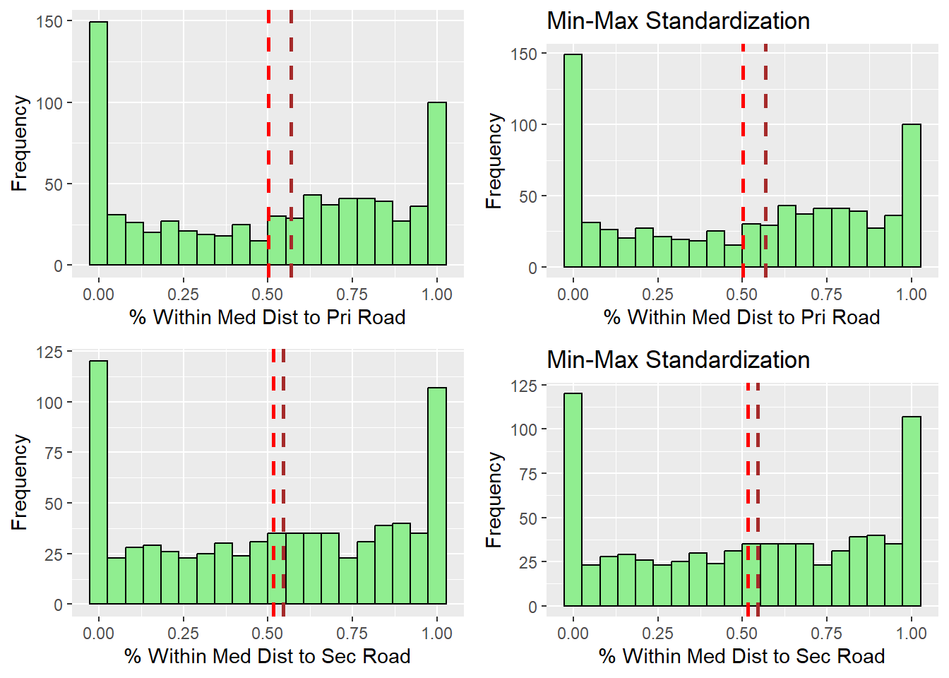
After observing the histograms, we can conclude that the distribution did not change for all of the variables. preserving the nature of the data post standardization.
Determine the proximity matrix.
With R’s dist() function, we shall compute the proximity matrix. The six distance proximity calculations that are supported by dist() are the euclidean, maximum, manhattan, canberra, binary, and minkowski methods.
As the variables are largely dissimilar, we use the minkowski method to create our proximity matrix
proxmat = dist(nga_wp_corr_vars.std_minmax, method="minkowski")Computing hierarchical clustering
Hierarchical clustering is an unsupervised machine learning technique that divides objects into clusters based on how related they are. The result is a collection of clusters, each of which differs from the others while having things that are generally similar to one another.
A tree-like diagram known as a Dendrogram is used to record the sequences of mergers and splits in the result of the clustering process.
We can use hclust() method provided by the R Stat class to find our clusters with our proximity matrix we found earlier using the ward.d method. The Dendrogram is drawn using plot() of R graphics
hclust_ward_d = hclust(proxmat, method="ward.D")
plot(hclust_ward_d, cex=0.5) 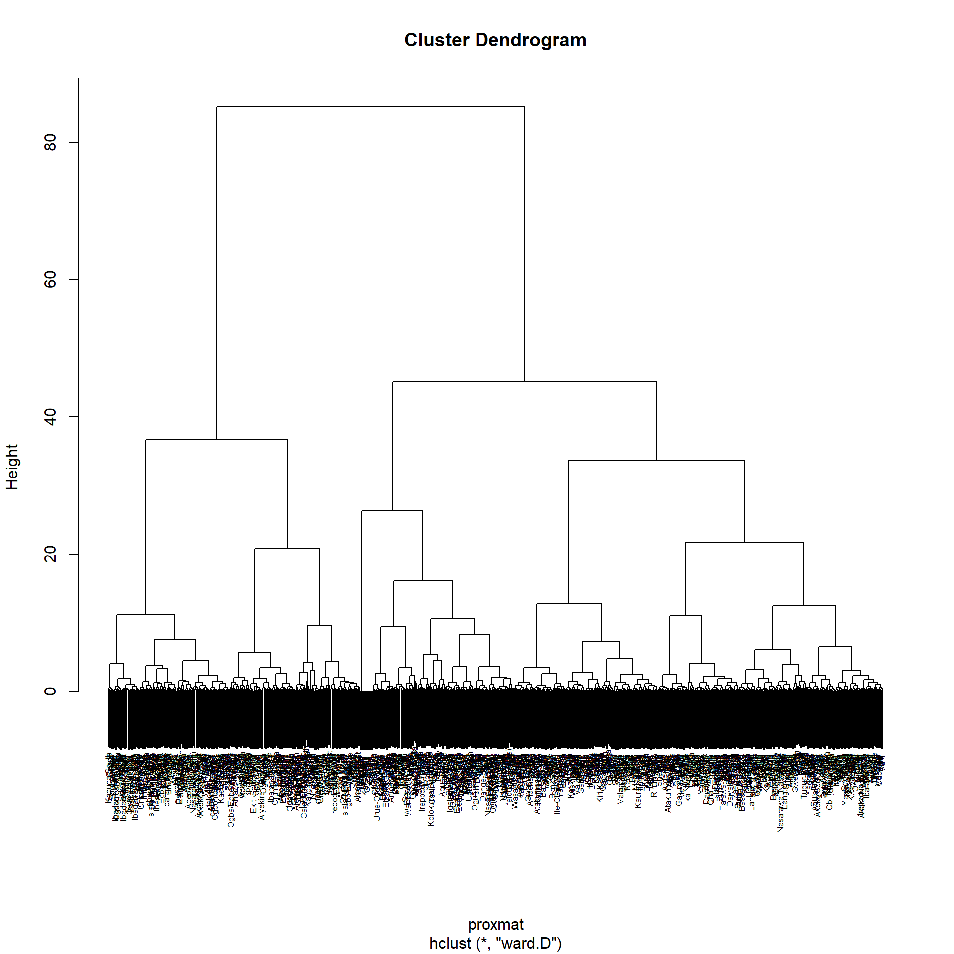
Selecting the optimal clustering algorithm
Finding stronger clustering structures is a challenge when performing hierarchical clustering. Using the agnes() function of the cluster package will address the issue.
It performs similar operations to hclus(), but agnes() also provides the agglomerative coefficient, which gauges the degree of clustering structure present
values closer to 1 suggest strong clustering structure
We define the different methods and name of them in the variable m and define a function to find the agglomerative coefficient (ac). By calling map_dbl(m, ac) we can iterate through the list to find the respective ac of the different functions
m = c("average", "single", "complete", "ward")
names(m) = c("average", "single", "complete", "ward")
ac = function(y) {
agnes(nga_wp_corr_vars.std_minmax, method=y)$ac
}
map_dbl(m,ac) average single complete ward
0.8380549 0.7449947 0.8951088 0.9773638 According to the results shown above, Ward approach offers the greatest clustering structure out of the four examined methods as it is closest to 1. Consequently, only Ward’s technique will be applied in the analysis that follows.
Determining Optimal Clusters
We can use the gap statistic contrasts the overall intra-cluster variation for various values of k with the values that would be predicted under a null reference distribution for the dataset.
The value that maximizes the gap statistic will be used to estimate the best clusters (i.e., that yields the largest gap statistic). In other words, the clustering structure is very different from a randomly distributed, uniform distribution of points.
To compute the gap statistic, clusGap() of cluster package will be used. with the hcut function from factoextra package. hcut calculates the hierarchical clustering and cuts the tree.
We set k.max to 10 as there are 10 variable involved and we want to find the global maximum to determine the best value of k.
set.seed(12345)
gap_stat = clusGap(nga_wp_corr_vars.std_minmax,
FUN=hcut, nstart=25, K.max = 10, B = 50)
# Print the result
print(gap_stat, method = "globalmax")Clustering Gap statistic ["clusGap"] from call:
clusGap(x = nga_wp_corr_vars.std_minmax, FUNcluster = hcut, K.max = 10, B = 50, nstart = 25)
B=50 simulated reference sets, k = 1..10; spaceH0="scaledPCA"
--> Number of clusters (method 'globalmax'): 10
logW E.logW gap SE.sim
[1,] 5.369914 5.927914 0.5579998 0.006209563
[2,] 5.274207 5.870306 0.5960990 0.007936739
[3,] 5.200430 5.830134 0.6297037 0.007236885
[4,] 5.145112 5.798004 0.6528922 0.007492569
[5,] 5.099037 5.772681 0.6736438 0.007149194
[6,] 5.058337 5.750803 0.6924662 0.006869284
[7,] 5.020069 5.731116 0.7110465 0.007087548
[8,] 4.991224 5.713128 0.7219043 0.007305436
[9,] 4.966661 5.696691 0.7300304 0.007049294
[10,] 4.945148 5.681387 0.7362390 0.006970684Next, we can visualize the plot by using fviz_gap_stat() of factoextra package.
fviz_gap_stat(gap_stat)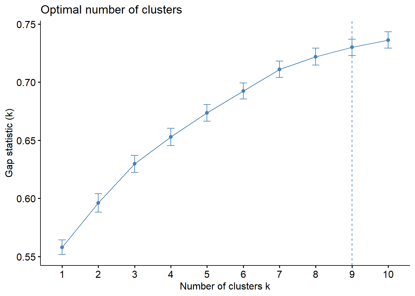
We can infer from the figure above that 9 clusters is the optimum number for the Hierarchical Clustering Algorithm.
Using R stats’ rect.hclust() function, the dendrogram can alternatively be plotted with a border around the chosen clusters. The rectangles’ borders can be colored using the option border.
plot(hclust_ward_d, cex=0.6)
rect.hclust(hclust_ward_d, k = 9, border = 2:9)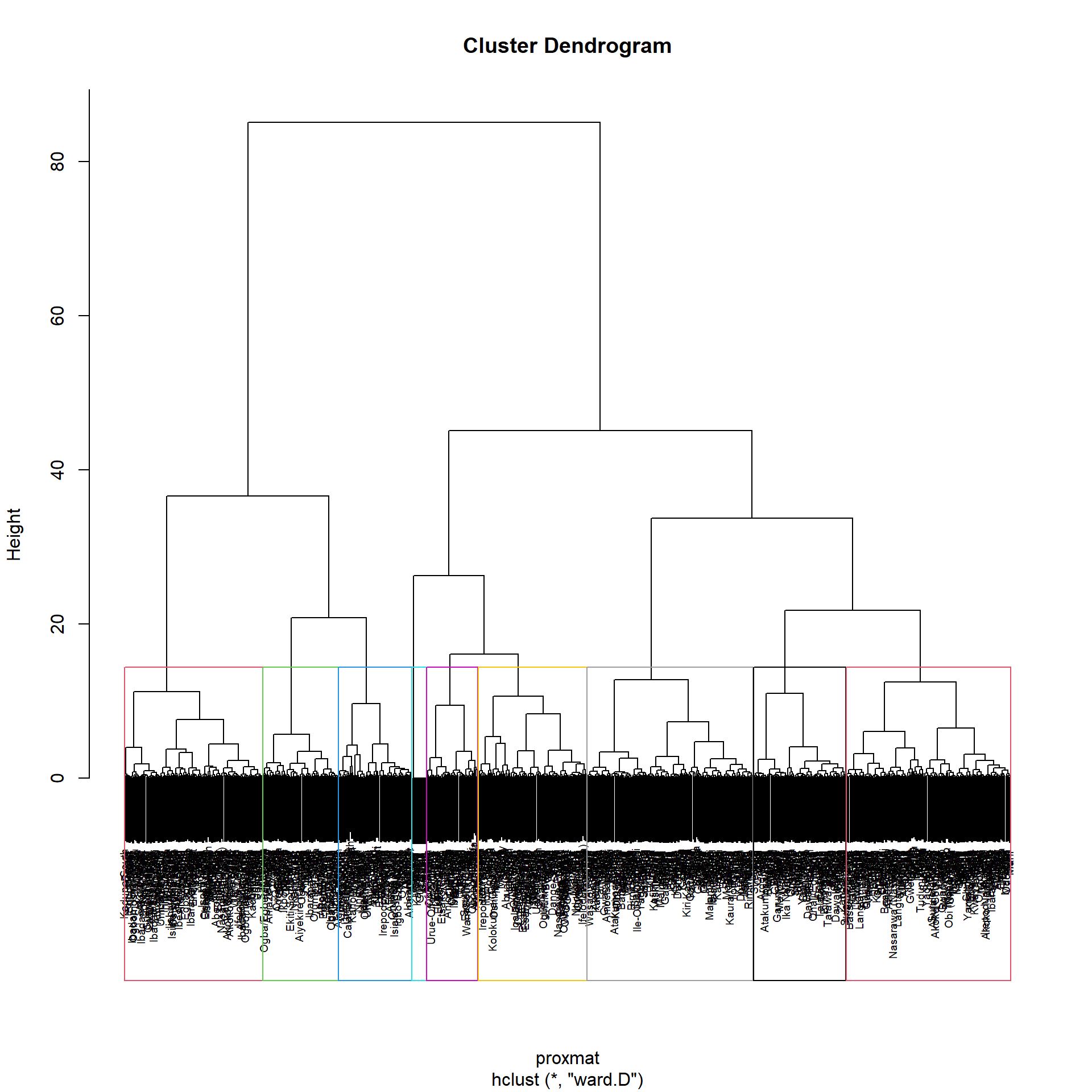
Visually-driven hierarchical clustering analysis
By using heatmaply package we are able to build both highly interactive cluster heat map or static cluster heatmap.
nga_wp_corr_vars.std_minmax_mat = data.matrix(nga_wp_corr_vars.std_minmax)Plotting interactive cluster heat map using heatmaply(), to make it consistent, we will use the minkowski distance method.
heatmaply(normalize(nga_wp_corr_vars.std_minmax_mat),
Colv=NA,
dist_method = "minkowski",
hclust_method = "ward.D",
seriate = "OLO",
colors=PuRd,
k_row = 9,
margins= c(NA, 200, 60, NA),
fontsize_row = 4,
fontsize_col = 5,
main = "Segmentation of Nigeria water points",
xlab = "Water point indicators",
ylab = "Nigeria LGA"
)From the heat map, it can be observed that the following variables pct_functional, pct_Potable, pct_Cap_Under_1000 & pct_rural are likely to form clusters of high concentrations between the LGAs.
Mapping the clusters formed in hierarchical clustering
Following the analysis of the above, we will use \(k=9\). The code below will use R Base’s cutree() function to create a 9-cluster model.
groups = as.factor(cutree(hclust_ward_d, k=9))The groups object needs to be added to the nga simple feature object in order to visualize the clusters.
The following code snippet forms the join in 3 steps:
The object representing the groups list will be transformed into a matrix;
nga is appended with the groups matrix using
cbind()to create the simple feature object nga_wp_cluster;The as.matrix.groups column is renamed to CLUSTER using the dplyr package’s
rename()function.
nga_wp_cluster = cbind(nga, as.matrix(groups)) %>%
rename(`CLUSTER` = `as.matrix.groups.`)Next we use the tmap functions to plot the choropleth map showing the clusters
nga_wp_hclust_map = tm_shape(nga_wp_cluster) +
tm_layout(main.title="Distribution of H Clusters",
main.title.position="center",
main.title.size=0.9,
legend.height = 0.35,
legend.width = 0.35,
frame = TRUE) +
tm_polygons("CLUSTER") +
tm_view(set.zoom.limits = c(5,10)) +
tm_borders(alpha = 0.5)
nga_wp_hclust_mapWithout any spatial constraints, the map produced nine erratic groupings, and the regions that made up the clusters are dispersed throughout the map. This is sub optimal as there may be real world considerations that necessitates the regionalization of areas into distinct regions, such as urban planning.
Spatially Constrained Clustering
Now that we know utilizing overarching clustering without spatial considerations can form fragmented clusters that are not optimal, lets looks at adding spatial constraints
SKATER approach
SKATER stands for Spatial ’K’luster Analysis by Tree Edge Removal (Assuncao & Krainski (n.d)). This function starts with a set of edges, an input dataset and a number of cuts to form clusters that are homogeneous
We will use the skater() method of the spdep package to derive a geographically limited cluster in this section.
First We must first transform nga into a spatial polygons data frame. This is because only SP objects (SpatialPolygonDataFrame) are supported by the SKATER function.
nga_sp = as_Spatial(nga)Computing Neighbour List
The neighbours list from the polygon list will then be computed using the poly2nb() function of the spdep package.
nga_sp.nb = poly2nb(nga_sp)
summary(nga_sp.nb)Neighbour list object:
Number of regions: 774
Number of nonzero links: 4440
Percentage nonzero weights: 0.7411414
Average number of links: 5.736434
1 region with no links:
86
Link number distribution:
0 1 2 3 4 5 6 7 8 9 10 11 12 14
1 2 14 57 125 182 140 122 72 41 12 4 1 1
2 least connected regions:
138 560 with 1 link
1 most connected region:
508 with 14 linksFrom the output, there are 774 LGAs in Nigeria, Using the Queen’s method, 1 of them has 14 neighbours, 1 of them is an island (no neighbour), and 2 of them only has 1 neighbour
We must create the weights matrix after determining the spatial weights. A isolated island can be found in the neighbor list’s results. Since this island won’t have any neighbors at all, it is not recommended to utilize a contiguity weight matrix. In light of this, we’ll employ a weight matrix based on distance instead.
Building the weights matrix
As there is an island involved, we will build an adaptive weight matrix as all features should have at least one neighbour if we were to use a fixed distance matrix.
Using the k nearest neighbor (knn) technique, we can adjust how many neighbors each LGA has. As discussed in class, we set k in this instance to 8. The R functions used in this case are knn2nb() and knearneigh()
For distance based matrix, we will need to perform st_transform() first, and recreate the nga_sp for the SpatialPolygonDataFrame
nga_local = st_transform(nga, crs=26392)
st_crs(nga_local)Coordinate Reference System:
User input: EPSG:26392
wkt:
PROJCRS["Minna / Nigeria Mid Belt",
BASEGEOGCRS["Minna",
DATUM["Minna",
ELLIPSOID["Clarke 1880 (RGS)",6378249.145,293.465,
LENGTHUNIT["metre",1]]],
PRIMEM["Greenwich",0,
ANGLEUNIT["degree",0.0174532925199433]],
ID["EPSG",4263]],
CONVERSION["Nigeria Mid Belt",
METHOD["Transverse Mercator",
ID["EPSG",9807]],
PARAMETER["Latitude of natural origin",4,
ANGLEUNIT["degree",0.0174532925199433],
ID["EPSG",8801]],
PARAMETER["Longitude of natural origin",8.5,
ANGLEUNIT["degree",0.0174532925199433],
ID["EPSG",8802]],
PARAMETER["Scale factor at natural origin",0.99975,
SCALEUNIT["unity",1],
ID["EPSG",8805]],
PARAMETER["False easting",670553.98,
LENGTHUNIT["metre",1],
ID["EPSG",8806]],
PARAMETER["False northing",0,
LENGTHUNIT["metre",1],
ID["EPSG",8807]]],
CS[Cartesian,2],
AXIS["(E)",east,
ORDER[1],
LENGTHUNIT["metre",1]],
AXIS["(N)",north,
ORDER[2],
LENGTHUNIT["metre",1]],
USAGE[
SCOPE["Engineering survey, topographic mapping."],
AREA["Nigeria between 6°30'E and 10°30'E, onshore and offshore shelf."],
BBOX[3.57,6.5,13.53,10.51]],
ID["EPSG",26392]]nga_sp = as_Spatial(nga_local)Before we can start building the matrix, we first need to find the coordinates
The longitude is the first variable in each centroid, this enables us to obtain only the longitude.
The latitude is the second variable in each centroid, this enables us to obtain only the latitude
Using the double bracket notation [[]] and the index, we can access the latitude & longitude values.
After getting the longitude and latitudes values, we can form the coordinates object named
coordusingcbind.
longitude = map_dbl(nga_local$geometry, ~st_centroid(.x)[[1]]) #longitude index 1
latitude = map_dbl(nga_local$geometry, ~st_centroid(.x)[[2]]) #latitude index 2
coord = cbind(longitude, latitude)We then run the algorithm to create the adaptive distance matrix using knn2nb() and knearneigh()
We set longlat to False as the projection have already been changed to EPSG 26392, Nigeria Mid Belt
knn8 = knn2nb(knearneigh(coord, k=8, longlat = FALSE))Computing minimum spanning tree
Calculating edge costs
The cost of each edge is determined using nbcosts() from the spdep package. Its nodes are separated by this distance. This function uses a data frame with observations vectors in each node to calculate the distance.
lcosts = nbcosts(knn8, nga_wp_corr_vars.std_minmax_mat)Next, in a manner similar to how we calculated the inverse of distance weights, we will include these costs into a weights object. In other words, we specify the recently computed lcosts as the weights in order to transform the neighbour list into a list weights object. To accomplish this, we can use using the nb2listw() function of spdep package. We will use the ‘B’ Style as it will be more robust
nga_wp_corr_vars.std_minmax_mat.w = nb2listw(knn8, lcosts, style="B")
summary(nga_wp_corr_vars.std_minmax_mat.w)Characteristics of weights list object:
Neighbour list object:
Number of regions: 774
Number of nonzero links: 6192
Percentage nonzero weights: 1.033592
Average number of links: 8
Non-symmetric neighbours list
Link number distribution:
8
774
774 least connected regions:
1 2 3 4 5 6 7 8 9 10 11 12 13 14 15 16 17 18 19 20 21 22 23 24 25 26 27 28 29 30 31 32 33 34 35 36 37 38 39 40 41 42 43 44 45 46 47 48 49 50 51 52 53 54 55 56 57 58 59 60 61 62 63 64 65 66 67 68 69 70 71 72 73 74 75 76 77 78 79 80 81 82 83 84 85 86 87 88 89 90 91 92 93 94 95 96 97 98 99 100 101 102 103 104 105 106 107 108 109 110 111 112 113 114 115 116 117 118 119 120 121 122 123 124 125 126 127 128 129 130 131 132 133 134 135 136 137 138 139 140 141 142 143 144 145 146 147 148 149 150 151 152 153 154 155 156 157 158 159 160 161 162 163 164 165 166 167 168 169 170 171 172 173 174 175 176 177 178 179 180 181 182 183 184 185 186 187 188 189 190 191 192 193 194 195 196 197 198 199 200 201 202 203 204 205 206 207 208 209 210 211 212 213 214 215 216 217 218 219 220 221 222 223 224 225 226 227 228 229 230 231 232 233 234 235 236 237 238 239 240 241 242 243 244 245 246 247 248 249 250 251 252 253 254 255 256 257 258 259 260 261 262 263 264 265 266 267 268 269 270 271 272 273 274 275 276 277 278 279 280 281 282 283 284 285 286 287 288 289 290 291 292 293 294 295 296 297 298 299 300 301 302 303 304 305 306 307 308 309 310 311 312 313 314 315 316 317 318 319 320 321 322 323 324 325 326 327 328 329 330 331 332 333 334 335 336 337 338 339 340 341 342 343 344 345 346 347 348 349 350 351 352 353 354 355 356 357 358 359 360 361 362 363 364 365 366 367 368 369 370 371 372 373 374 375 376 377 378 379 380 381 382 383 384 385 386 387 388 389 390 391 392 393 394 395 396 397 398 399 400 401 402 403 404 405 406 407 408 409 410 411 412 413 414 415 416 417 418 419 420 421 422 423 424 425 426 427 428 429 430 431 432 433 434 435 436 437 438 439 440 441 442 443 444 445 446 447 448 449 450 451 452 453 454 455 456 457 458 459 460 461 462 463 464 465 466 467 468 469 470 471 472 473 474 475 476 477 478 479 480 481 482 483 484 485 486 487 488 489 490 491 492 493 494 495 496 497 498 499 500 501 502 503 504 505 506 507 508 509 510 511 512 513 514 515 516 517 518 519 520 521 522 523 524 525 526 527 528 529 530 531 532 533 534 535 536 537 538 539 540 541 542 543 544 545 546 547 548 549 550 551 552 553 554 555 556 557 558 559 560 561 562 563 564 565 566 567 568 569 570 571 572 573 574 575 576 577 578 579 580 581 582 583 584 585 586 587 588 589 590 591 592 593 594 595 596 597 598 599 600 601 602 603 604 605 606 607 608 609 610 611 612 613 614 615 616 617 618 619 620 621 622 623 624 625 626 627 628 629 630 631 632 633 634 635 636 637 638 639 640 641 642 643 644 645 646 647 648 649 650 651 652 653 654 655 656 657 658 659 660 661 662 663 664 665 666 667 668 669 670 671 672 673 674 675 676 677 678 679 680 681 682 683 684 685 686 687 688 689 690 691 692 693 694 695 696 697 698 699 700 701 702 703 704 705 706 707 708 709 710 711 712 713 714 715 716 717 718 719 720 721 722 723 724 725 726 727 728 729 730 731 732 733 734 735 736 737 738 739 740 741 742 743 744 745 746 747 748 749 750 751 752 753 754 755 756 757 758 759 760 761 762 763 764 765 766 767 768 769 770 771 772 773 774 with 8 links
774 most connected regions:
1 2 3 4 5 6 7 8 9 10 11 12 13 14 15 16 17 18 19 20 21 22 23 24 25 26 27 28 29 30 31 32 33 34 35 36 37 38 39 40 41 42 43 44 45 46 47 48 49 50 51 52 53 54 55 56 57 58 59 60 61 62 63 64 65 66 67 68 69 70 71 72 73 74 75 76 77 78 79 80 81 82 83 84 85 86 87 88 89 90 91 92 93 94 95 96 97 98 99 100 101 102 103 104 105 106 107 108 109 110 111 112 113 114 115 116 117 118 119 120 121 122 123 124 125 126 127 128 129 130 131 132 133 134 135 136 137 138 139 140 141 142 143 144 145 146 147 148 149 150 151 152 153 154 155 156 157 158 159 160 161 162 163 164 165 166 167 168 169 170 171 172 173 174 175 176 177 178 179 180 181 182 183 184 185 186 187 188 189 190 191 192 193 194 195 196 197 198 199 200 201 202 203 204 205 206 207 208 209 210 211 212 213 214 215 216 217 218 219 220 221 222 223 224 225 226 227 228 229 230 231 232 233 234 235 236 237 238 239 240 241 242 243 244 245 246 247 248 249 250 251 252 253 254 255 256 257 258 259 260 261 262 263 264 265 266 267 268 269 270 271 272 273 274 275 276 277 278 279 280 281 282 283 284 285 286 287 288 289 290 291 292 293 294 295 296 297 298 299 300 301 302 303 304 305 306 307 308 309 310 311 312 313 314 315 316 317 318 319 320 321 322 323 324 325 326 327 328 329 330 331 332 333 334 335 336 337 338 339 340 341 342 343 344 345 346 347 348 349 350 351 352 353 354 355 356 357 358 359 360 361 362 363 364 365 366 367 368 369 370 371 372 373 374 375 376 377 378 379 380 381 382 383 384 385 386 387 388 389 390 391 392 393 394 395 396 397 398 399 400 401 402 403 404 405 406 407 408 409 410 411 412 413 414 415 416 417 418 419 420 421 422 423 424 425 426 427 428 429 430 431 432 433 434 435 436 437 438 439 440 441 442 443 444 445 446 447 448 449 450 451 452 453 454 455 456 457 458 459 460 461 462 463 464 465 466 467 468 469 470 471 472 473 474 475 476 477 478 479 480 481 482 483 484 485 486 487 488 489 490 491 492 493 494 495 496 497 498 499 500 501 502 503 504 505 506 507 508 509 510 511 512 513 514 515 516 517 518 519 520 521 522 523 524 525 526 527 528 529 530 531 532 533 534 535 536 537 538 539 540 541 542 543 544 545 546 547 548 549 550 551 552 553 554 555 556 557 558 559 560 561 562 563 564 565 566 567 568 569 570 571 572 573 574 575 576 577 578 579 580 581 582 583 584 585 586 587 588 589 590 591 592 593 594 595 596 597 598 599 600 601 602 603 604 605 606 607 608 609 610 611 612 613 614 615 616 617 618 619 620 621 622 623 624 625 626 627 628 629 630 631 632 633 634 635 636 637 638 639 640 641 642 643 644 645 646 647 648 649 650 651 652 653 654 655 656 657 658 659 660 661 662 663 664 665 666 667 668 669 670 671 672 673 674 675 676 677 678 679 680 681 682 683 684 685 686 687 688 689 690 691 692 693 694 695 696 697 698 699 700 701 702 703 704 705 706 707 708 709 710 711 712 713 714 715 716 717 718 719 720 721 722 723 724 725 726 727 728 729 730 731 732 733 734 735 736 737 738 739 740 741 742 743 744 745 746 747 748 749 750 751 752 753 754 755 756 757 758 759 760 761 762 763 764 765 766 767 768 769 770 771 772 773 774 with 8 links
Weights style: B
Weights constants summary:
n nn S0 S1 S2
B 774 599076 5122.839 9000.114 148339.5Finding the minimum spanning tree
A minimum spanning trees is a graph where all the vertices are connected by weighted edges with no cycle with the minimum cost.
The minimum spanning tree is computed by using mstree() of spdep package as shown in the code below. We can check its class and dimensions by using class() and dim()
nga_wp_mst = mstree(nga_wp_corr_vars.std_minmax_mat.w)
class(nga_wp_mst)[1] "mst" "matrix"dim(nga_wp_mst)[1] 773 3The MST plot method includes a mechanism to display the nodes’ observation numbers in addition to the edge. We once again plot these along with the LGA lines. We can see how the initial neighbor list is condensed to a single edge that passes through every node
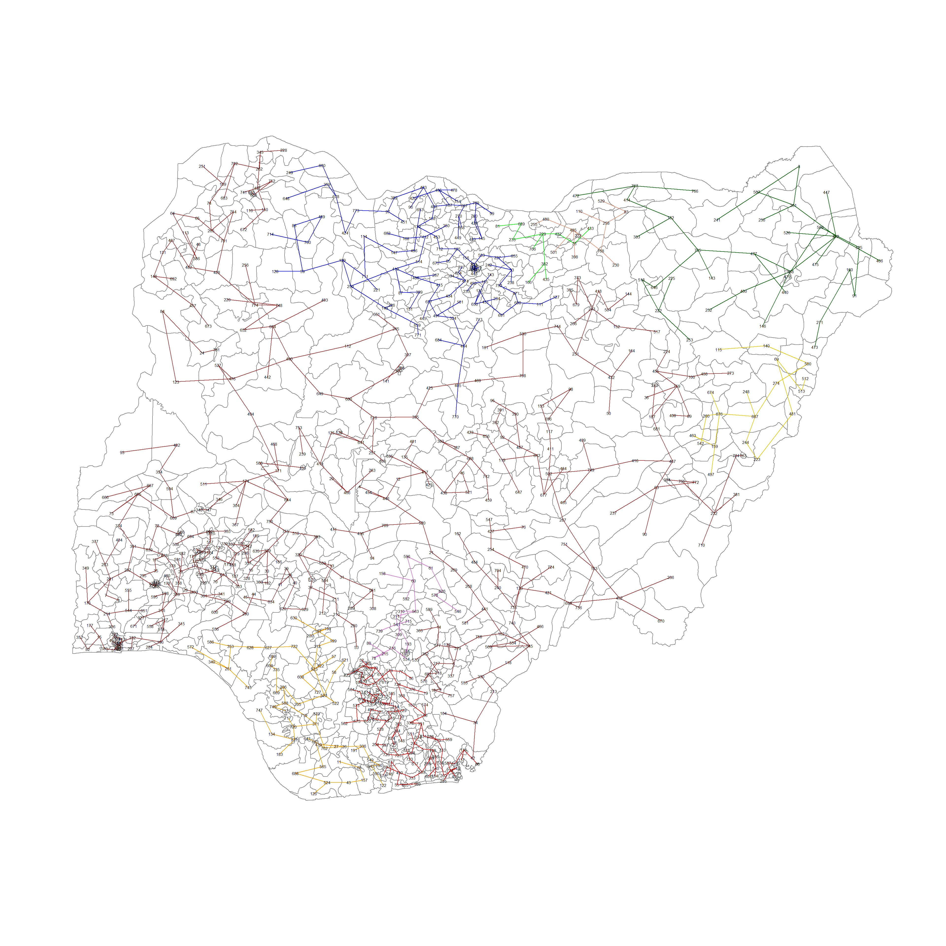
plot(nga_sp, border=gray(0.6))
plot.mst(nga_wp_mst, coordinates(nga_sp), col="blue",
cex.lab=0.7, cex.circles=0.05, add=TRUE)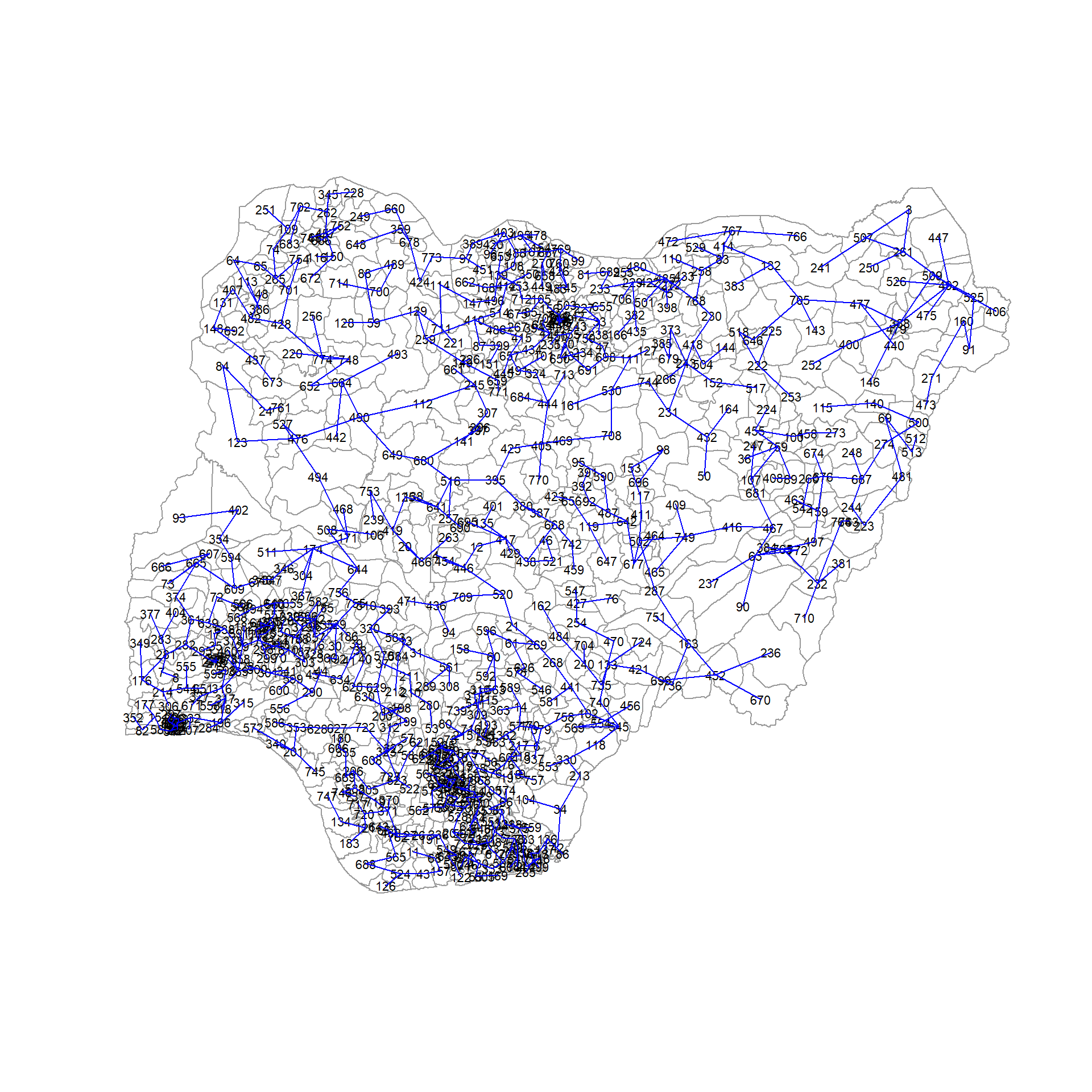
Computing spatially constrained clusters using SKATER method
We can compute the spatially constrained cluster using skater() of the spdep package.
Required inputs for the skater() function.
Data matrix (to update the costs while units are being grouped),
the number of cuts (no. of variables - 1)
the first two columns of the MST matrix
clust9 = skater(edge=nga_wp_mst[,1:2], #1st 2 col of MST
data = nga_wp_corr_vars, #data matrix
method = "minkowski",
ncuts = 8 #number of cuts
)Finally, we can plot the pruned tree that shows the 9 clusters on top of the LGA area.
plot(nga_sp, border=gray(.5))
plot(clust9,
coordinates(nga_sp),
cex.lab=0.5,
groups.colors=c("red","green","blue", "brown",
"orange", "darkgreen", "darksalmon", "gold2", "orchid"),
cex.circles=0.005,
add=TRUE
)
Visualizing the clusters in choropleth map
The code below is used to plot the newly derived clusters by using the SKATER method
groups_mat = as.matrix(clust9$groups)
nga_wp_spatialcluster = cbind(nga_wp_cluster, as.factor(groups_mat)) %>%
rename(`SP_CLUSTER` = `as.factor.groups_mat.`)
nga_wp_spatialcluster_map = tm_shape(nga_wp_spatialcluster) +
tm_layout(main.title="Distribution of clusters with SKATER",
main.title.position="center",
main.title.size=0.9,
legend.height = 0.35,
legend.width = 0.35,
frame = TRUE) +
tm_fill("SP_CLUSTER") +
tm_view(set.zoom.limits = c(5,10)) +
tm_borders(alpha = 0.5)
nga_wp_spatialcluster_mapWe can observe that once we added spatial constraints into the formula, there are 9 clusters that are mostly contiguous. This can help us make better decisions on what to do with each cluster and make planning easier when we need to consolidate resources.
The remarkable clusters are:
in the north eastern and eastern borders of Nigeria, where there are little to no water points,
the south western coast facing gulf of guinea and Bight of Benin where non functional water points congregate
North of Nigeria where functional points congregate
A really large cluster (Cluster 4) that covers almost the whole of Nigeria
Spatially Constrained Clustering - ClustGeo Method
Another method of introducing spatial constraints to use the ClustGeo package. We can make use of the hclustgeo() function in the ClustGeo package to perform Ward-style hierarchical clustering.
First we will need to create the nga_clustgeo_HClust by using hclustgeo() with the proximity matrix we created in the previous section and plot its corresponding Dendrogram
nga_clustgeo_HClust = hclustgeo(proxmat)
plot(nga_clustgeo_HClust, cex=0.5)
rect.hclust(nga_clustgeo_HClust, k=9, border = 2:9)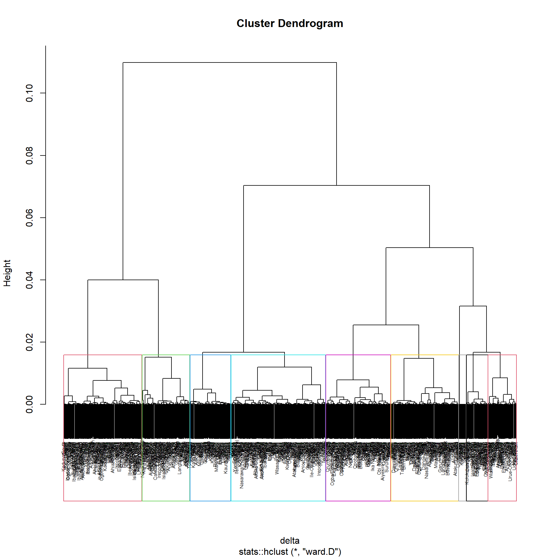
Mapping the clusters formed
Similarly, by applying the techniques we discovered in the section Mapping the clusters formed in hierarchical clustering, we may plot the clusters on a categorical area shaded map.
groups = as.factor(cutree(nga_clustgeo_HClust, k=9))
nga_clustgeo_HClust_cluster = cbind(nga, as.matrix(groups)) %>%
rename(`CLUSTER` = `as.matrix.groups.`)
nga_clustgeo_HClust_cluster_map = tm_shape(nga_clustgeo_HClust_cluster) +
tm_layout(main.title="Distribution of clusters with HClustGeo",
main.title.position="center",
main.title.size=0.9,
legend.height = 0.35,
legend.width = 0.35,
frame = TRUE) +
tm_polygons("CLUSTER") +
tm_view(set.zoom.limits = c(5,10)) +
tm_borders(alpha = 0.5)
nga_clustgeo_HClust_cluster_mapWithout spatial constraints, the map generated 9 clusters that are rather messy and the regions composing the clusters are dispersed throughout the map, which is sub-optimal. This is similar to the results we applied in the section Mapping the clusters formed in hierarchical clustering.
Spatially Constrained Hierarchical Clustering
Prior to starting the spatially constrained hierarchical clustering process, a spatial distance matrix will need to be derived by using st_distance() of the sf package.
dist = st_distance(nga, nga)as.dist() is used to convert the data frame into a matrix.
distmat = as.dist(dist)Our goal is to as much as possible retain the attribute homogeneity but also introduce spatial homogeneity. In order to balance this, we can compute ∝ using the choicealpha() function.
cr = choicealpha(proxmat, distmat, range.alpha = seq(0,1, 0.1), K=9, graph=T)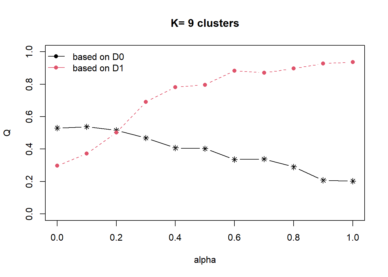
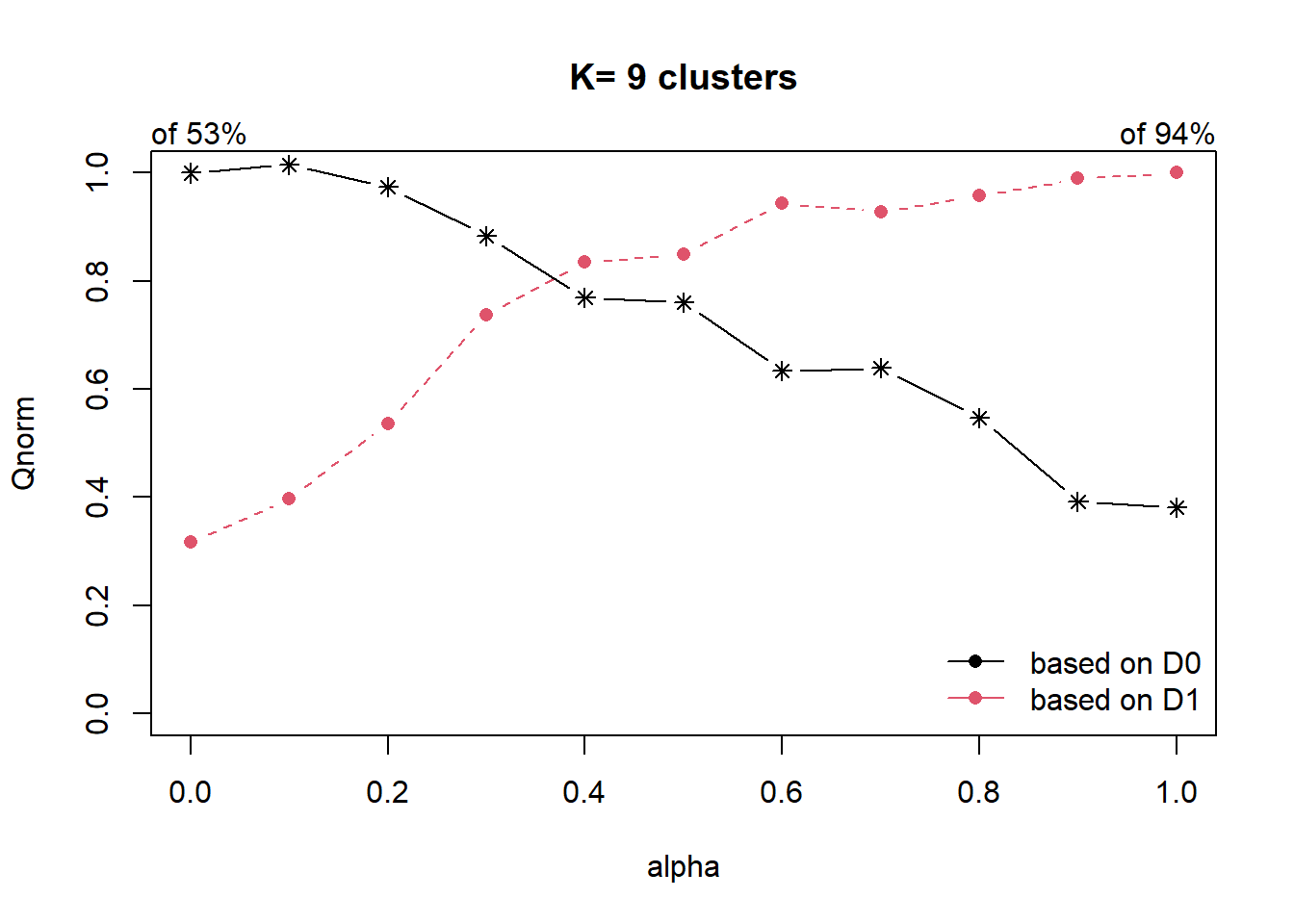
As the data is skewed as we have explored in our EDA, we will use the QNorm graph based on normalized values.
We can observe that when ∝ is raised from 0.2 to 0.4, the homogeneity of d1, which is our spatial relationship (contiguity matrix), gain significantly from about 50% to 80%. And for d0 (which is our attribute homogeneity), the loss is slightly more than 20%. Since ∝ = 0.4 is the most optimal, we will use it to form our cluster.
clustG = hclustgeo(proxmat, distmat, alpha = 0.4)We then use cutree() to derive the cluster object, and join it back to the nga polygon feature data frame by using cbind()
groups = as.factor(cutree(clustG, k=9))
nga_clustgeo_HClust_cluster_CA = cbind(nga, as.matrix(groups)) %>%
rename(`SP_CLUSTER` = `as.matrix.groups.`)We can now plot the map of the newly delineated spatially constraints clusters using functions of tmap
nga_clustgeo_HClust_cluster_CA_map =
tm_shape(nga_clustgeo_HClust_cluster_CA) +
tm_layout(main.title="Distribution of clusters with HClustGeo using choice alpha",
main.title.position="center",
main.title.size=0.9,
legend.height = 0.35,
legend.width = 0.35,
frame = TRUE) +
tm_polygons("SP_CLUSTER") +
tm_view(set.zoom.limits = c(5,10)) +
tm_borders(alpha = 0.5)
nga_clustgeo_HClust_cluster_CA_mapSimilarly to the skater method of the spdep package, we can observe that once we added alpha into the formula, there are now 9 clusters that are mostly contiguous. This can help us make better decisions on what to do with each cluster and make planning easier when we need to consolidate resources.
Comparing the Resultant map plots
We attempt to conclude by plotting the 4 maps together
tmap_arrange(nga_wp_hclust_map, nga_wp_spatialcluster_map,
nga_clustgeo_HClust_cluster_map, nga_clustgeo_HClust_cluster_CA_map,
ncol = 2, nrow = 2, asp = 1,
sync = TRUE)